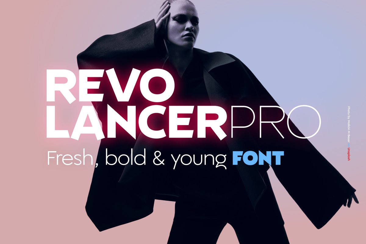
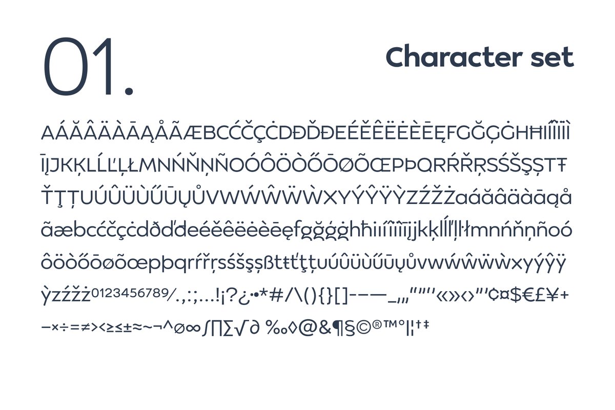
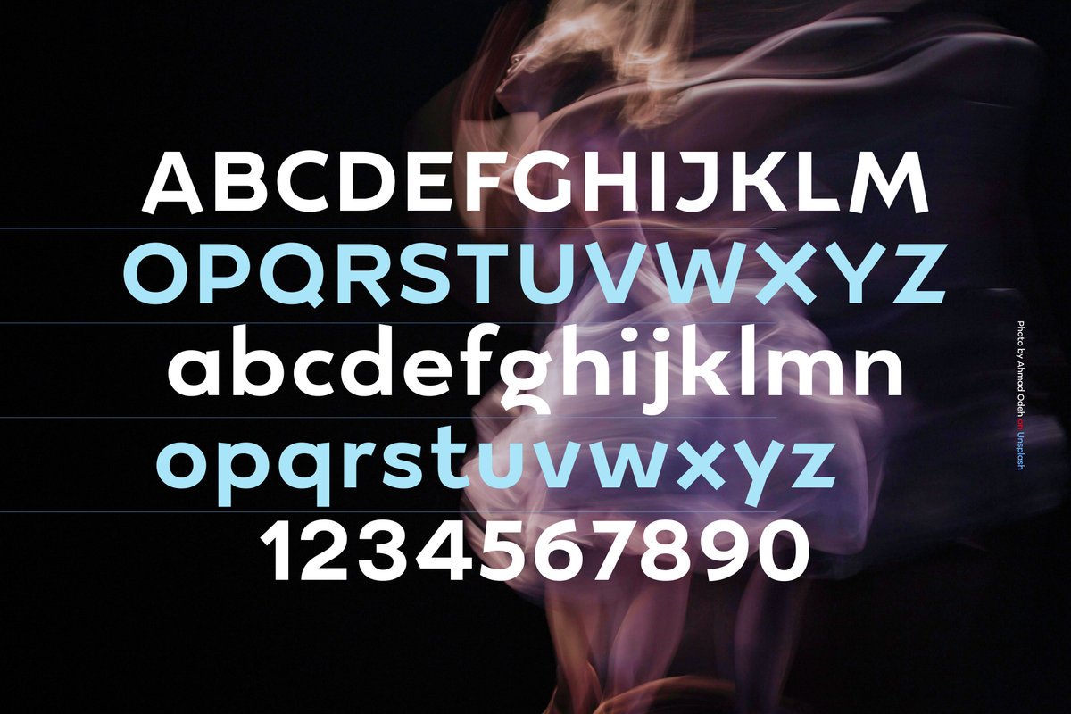
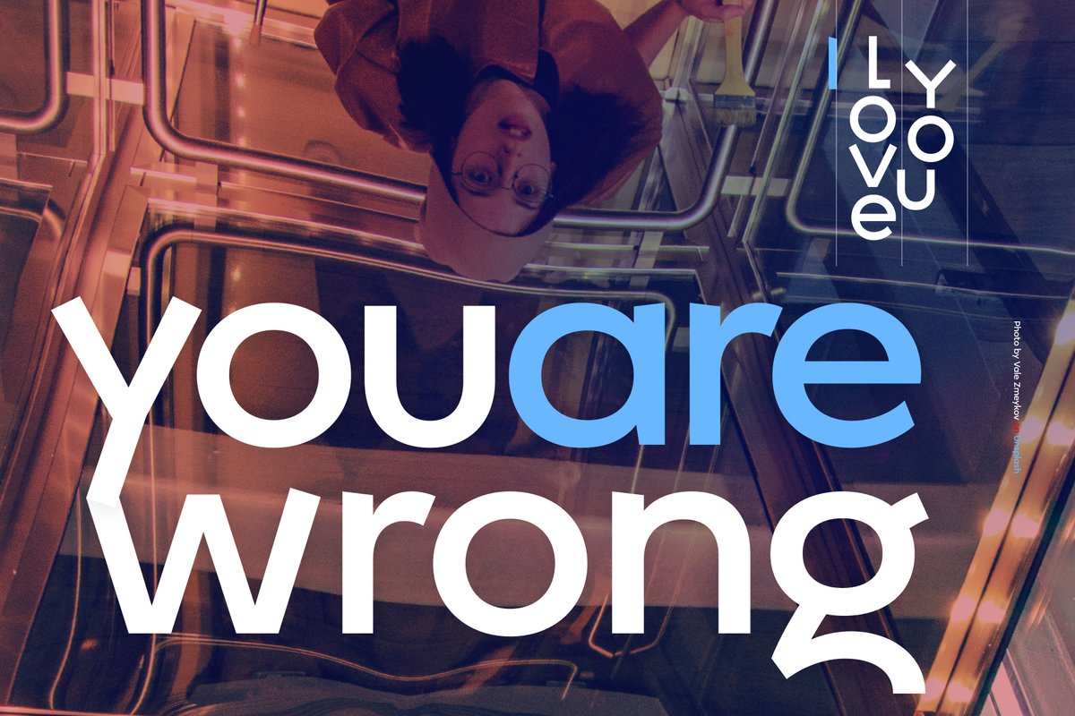
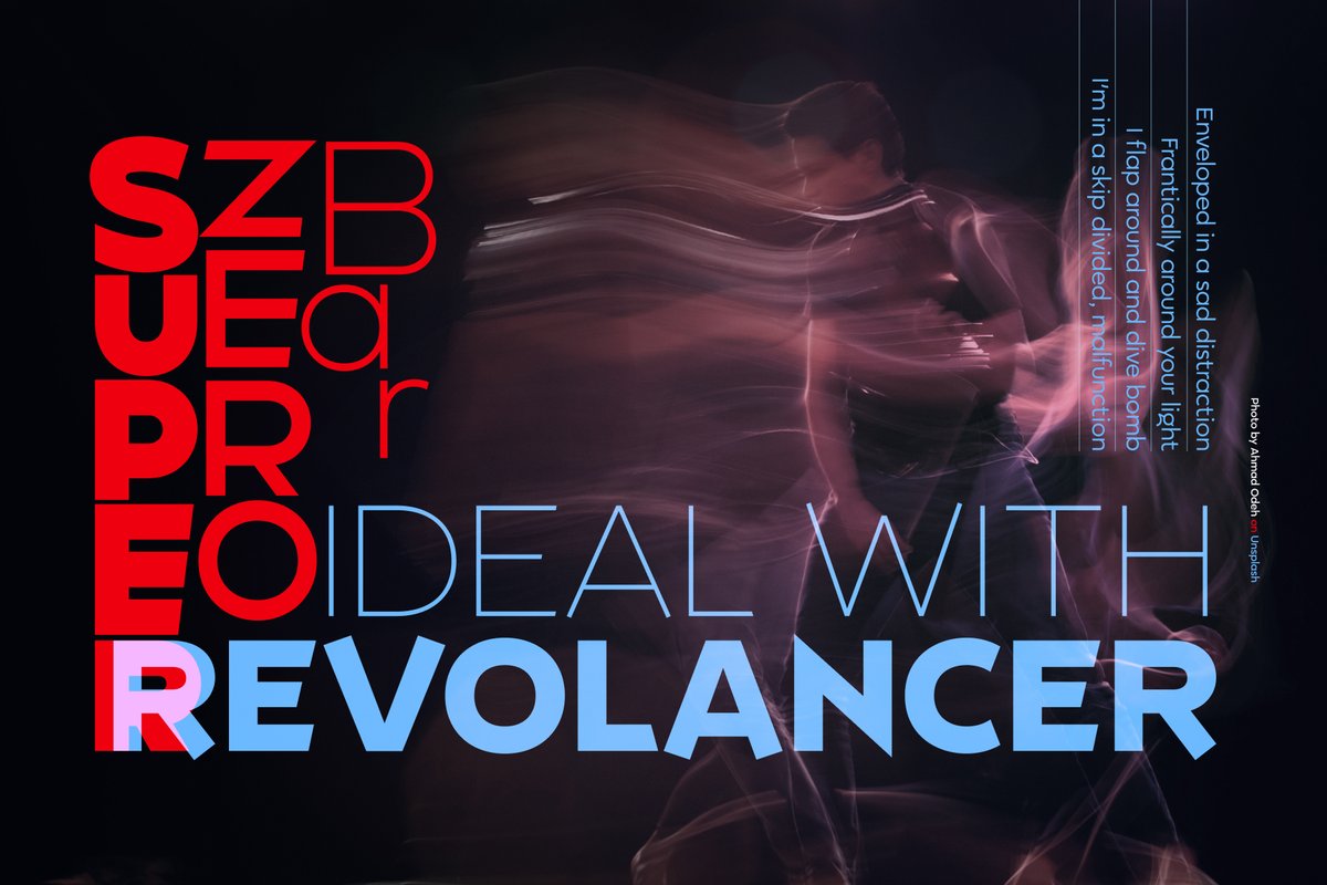
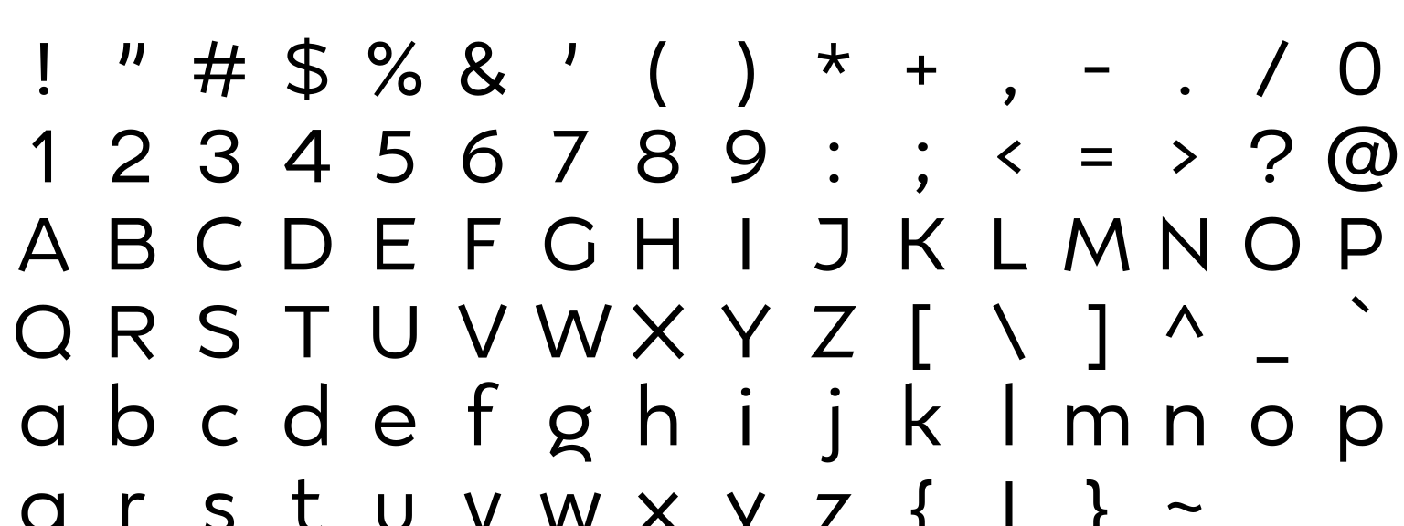
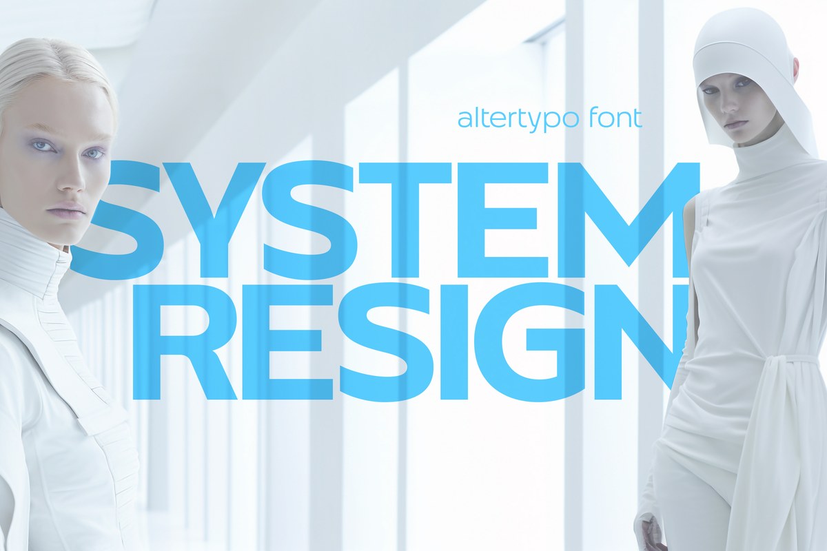
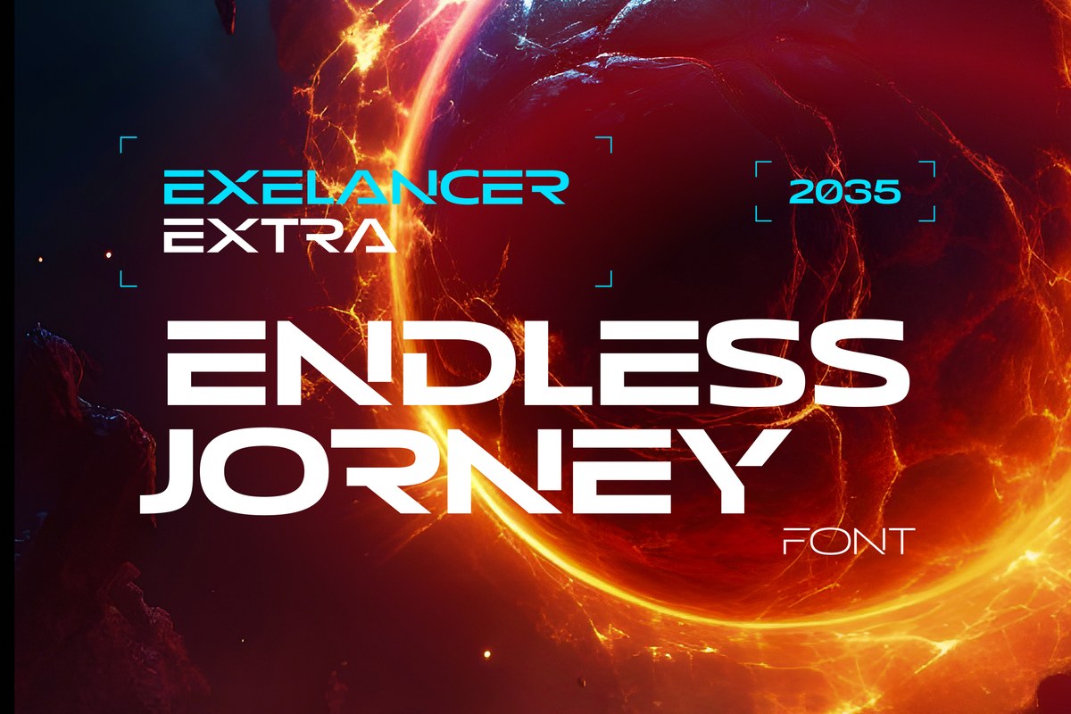
The Revolancer Pro font uses the simple geometric shapes of Revolancer, with no turned or flipped letters, so it stays easy to read. Use it for a startup logo, a product website, an app interface or a fashion campaign headline. It holds up from a big campaign line down to interface labels.
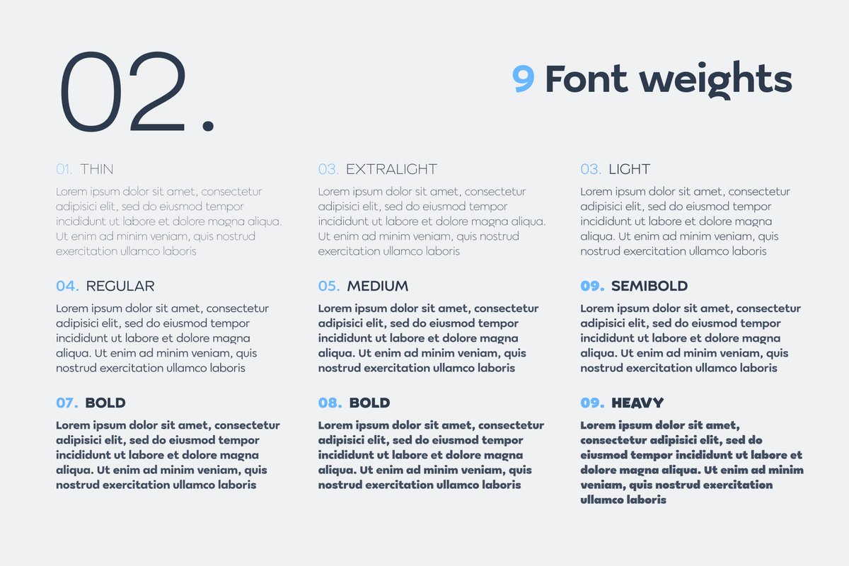
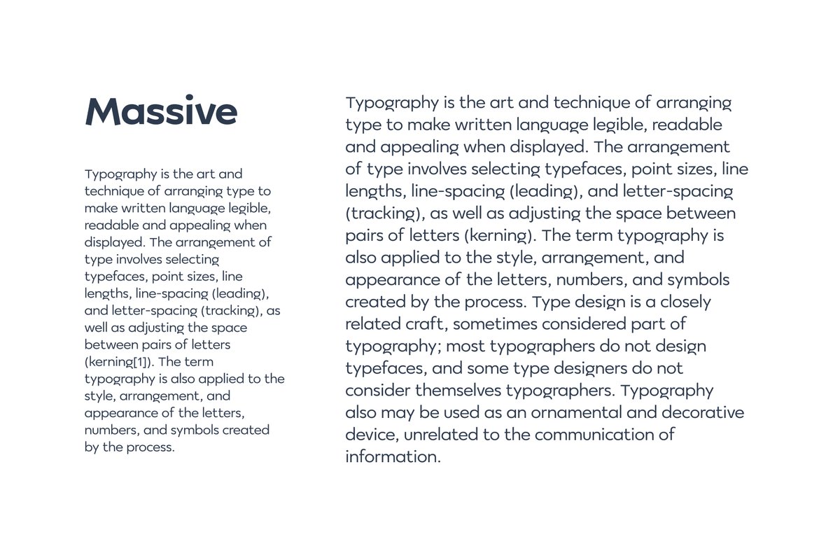
Revolancer Pro is a geometric sans in nine weights: Thin, ExtraLight, Light, Regular, Medium, SemiBold, Bold, Black and Heavy. If Revolancer is the experimental sibling, Pro is the one you can set in a paragraph: a white specimen sheet sets two columns of text at two sizes.
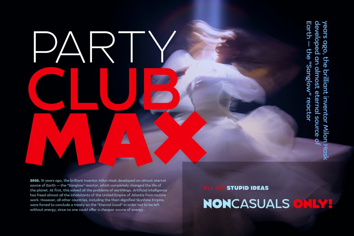
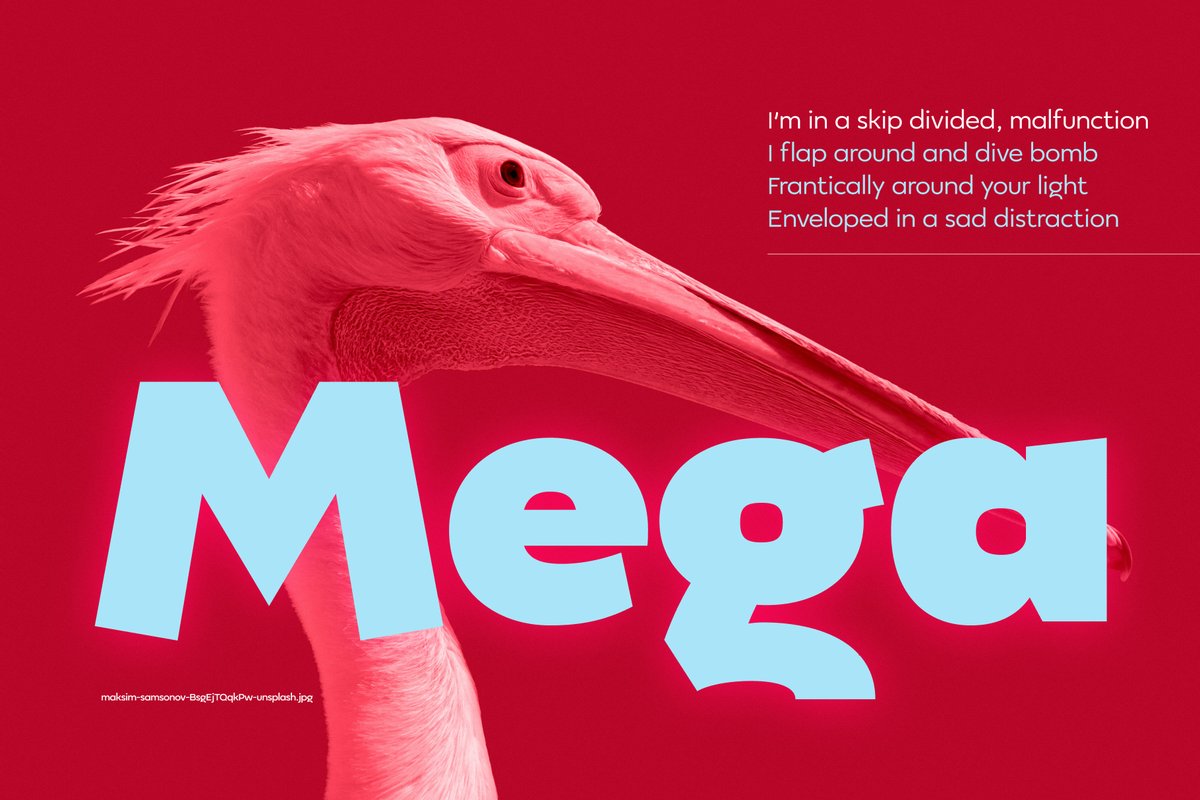
The specimens show it on photos and bold color: a dance photo with “Party Club Max” in thin white and bold red, and a red panel with a pink pelican and “Mega” in huge light-blue letters.
For an app, use Medium for buttons and Regular for body text. For a website, set the hero in Heavy and keep text in Regular. For a campaign, put the line over a photo and let Regular carry the paragraph.
When you need a poster headline in the same system, set it in Revolancer and keep Pro for the text.