Font

Altertypo

Altertypo is an elegant sans serif font for book pages, brand identity and websites, close in spirit to Gill Sans and Johnston.

Free sample Thin · ZIP

Free download (ZIP)

Free for one person: personal and commercial use, client work included. A studio or team using it in its own work buys the full family. No resale or redistribution of the file. Read the license.

Full family 9 styles, sold as one family

  • Altertypo · OTF · Thin to Heavy
Buy on Creative Market

Price and license are on the marketplace.

Altertypo Regular in a layout

The quiet city

Twelve neighborhoods where the streets still close for lunch.

We spent a month walking with a notebook and a borrowed camera. These are the bakeries, barbers and bookshops that kept their signs, their hours and their regulars.

Photographs by the author. Issue 14, spring. The full story is online.

Try your own text

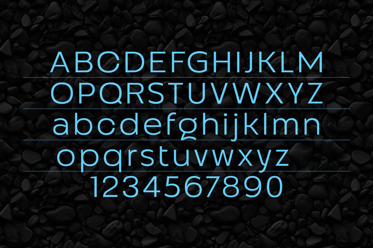
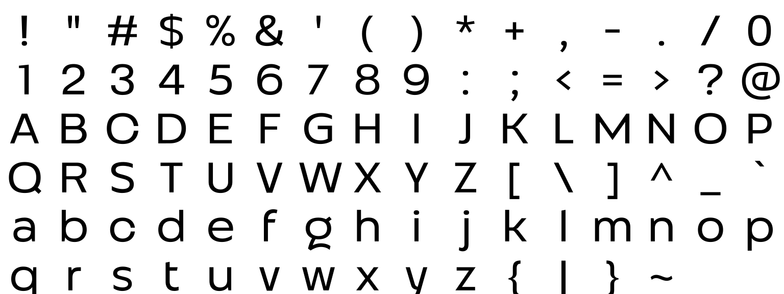
Altertypo Regular, Latin letters, figures and punctuation

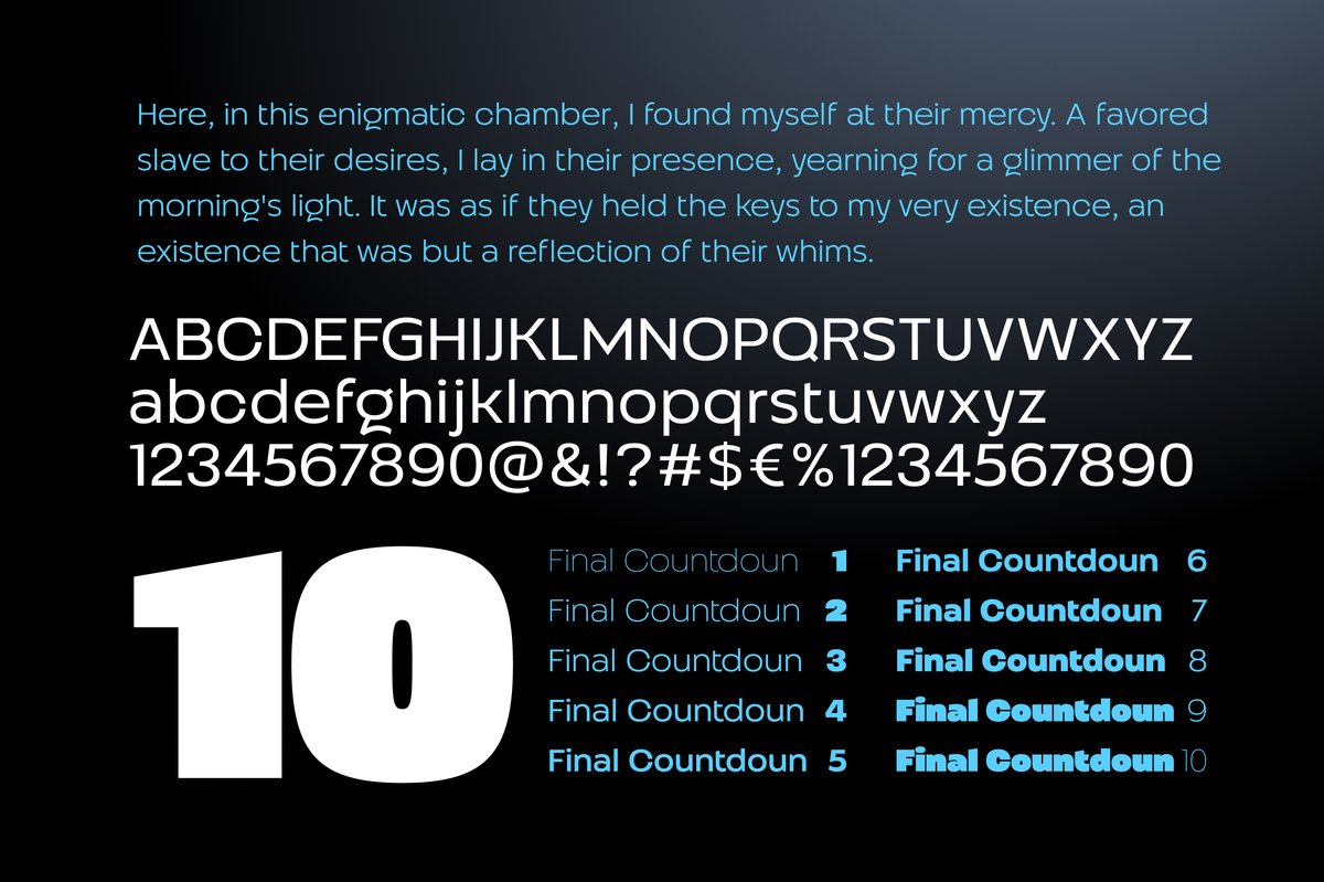
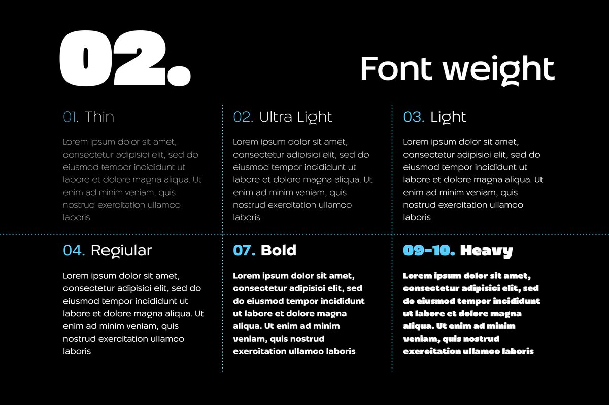
9 styles in the family

Altertypo 9 styles

  • Altertypo Thinfree sample
  • Altertypo Light
  • Altertypo Regular
  • Altertypo Medium
  • Altertypo SemiBold
  • Altertypo Bold
  • Altertypo ExtraBold
  • Altertypo Black
  • Altertypo Heavy
Get the full family on Creative Market

The family is sold as a whole, not style by style.

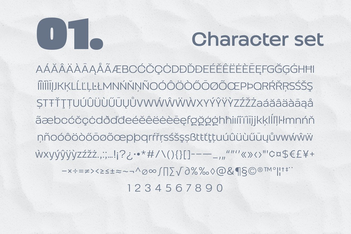
Characters

Latin letters, figures and punctuation of Altertypo

About Altertypo

Tip Round letters like o and c stay wide open, which keeps small text clear on screens and in print.

The Altertypo font is a calm, clear sans. Use it for a book interior, a corporate identity, a perfume label or a website that needs quiet, readable text. Light weights look refined in large titles; heavier ones work for menus and buttons.

Altertypo is close in spirit to Gill Sans and Johnston, the sans serifs of old railway posters and signs, which is why it feels familiar in a book or on a wayfinding sign. The nine weights run Thin, Light, Regular, Medium, SemiBold, Bold, ExtraBold, Black and Heavy.

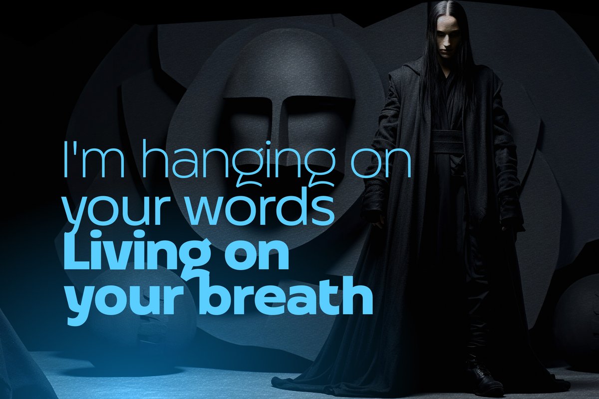
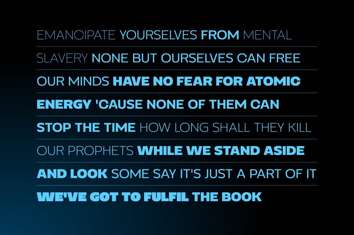
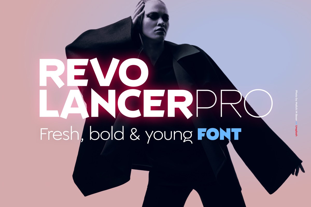
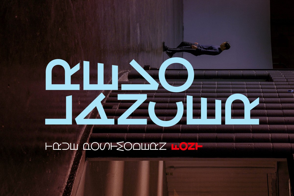
The specimens show two sides of it. The quiet side is a perfume label on a dark background with white blossoms. The loud side is a poster title in large light-blue capitals over a photo.

Choose weights by role. Regular for body copy, Medium for subheads, and Thin only at large sizes, where its strokes have room. A book interior can run on three weights: Regular for text, SemiBold for headings, Light for captions. Black and Heavy suit short headings.

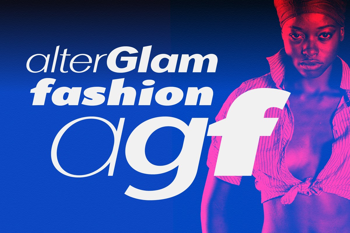
Alterscript makes a good partner for names and greetings, and AlterGlam gives the same family feeling a wider look for logos.


Similar fonts

Picked by tags: sans, branding, editorial, web.