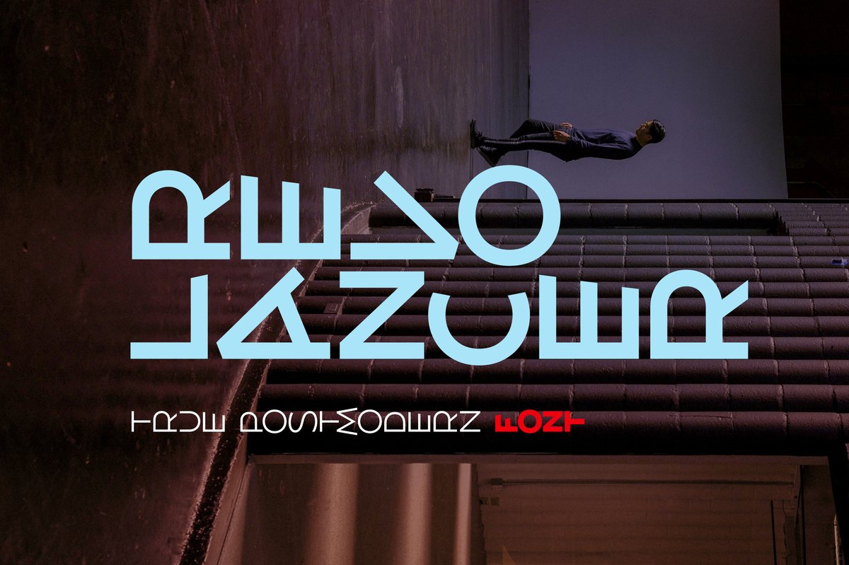
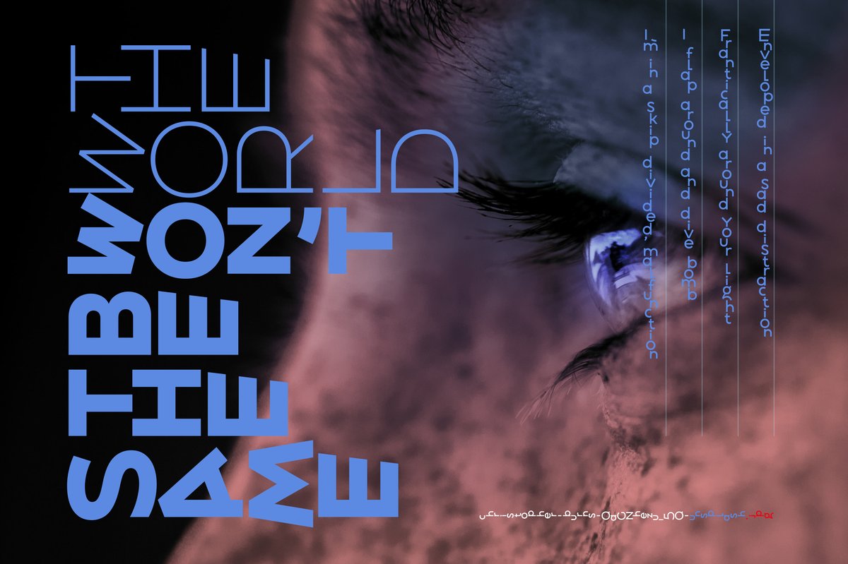
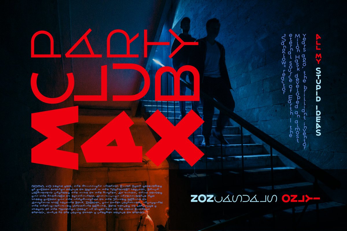
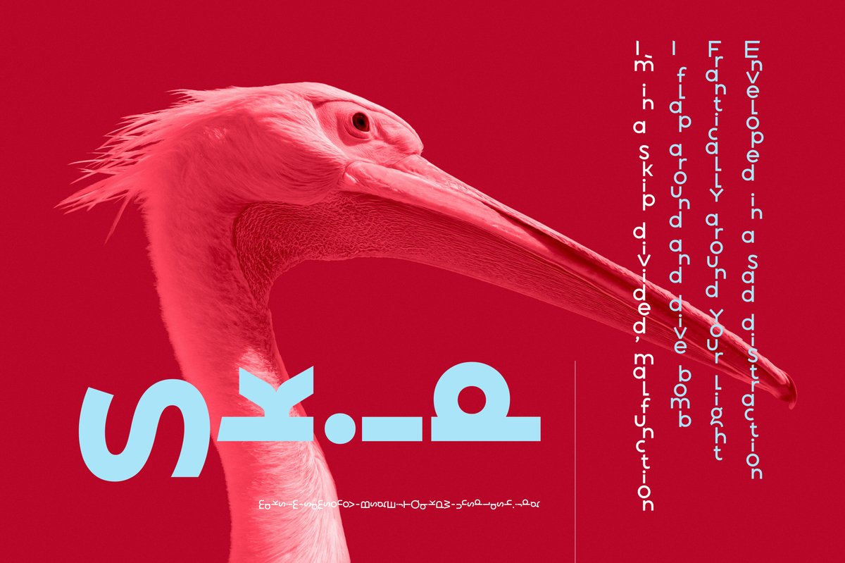
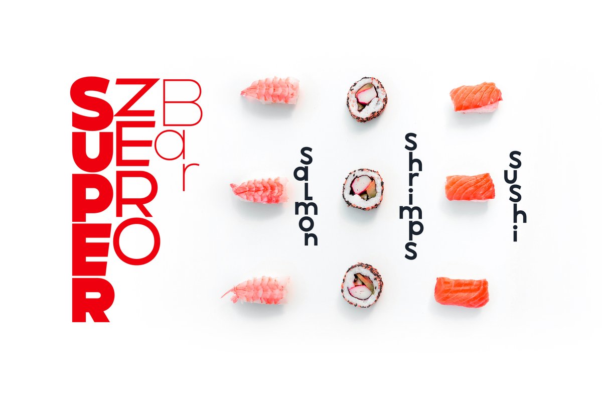
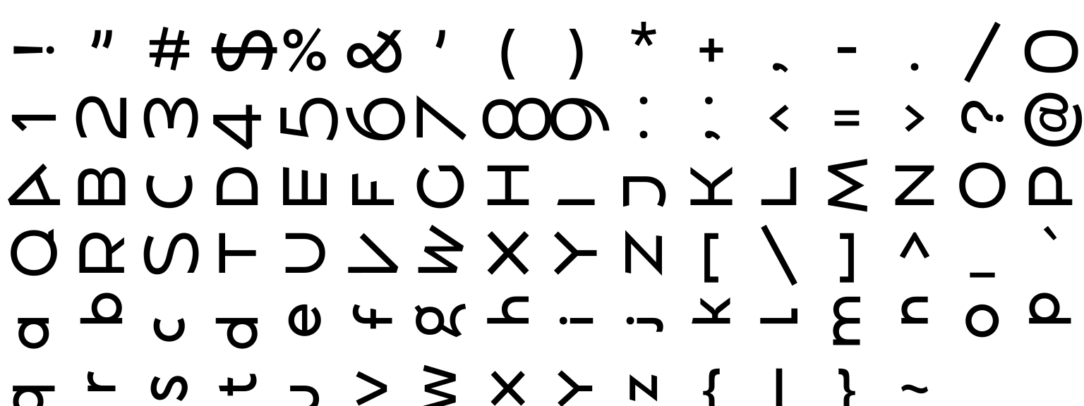
The Revolancer font treats letters as shapes: some come already rotated, flipped or laid on their side. Use it for an art-gallery identity, a fashion lookbook cover, a club poster or a record sleeve where the words are part of the picture. Keep one plain line of text nearby and let Revolancer be the image.
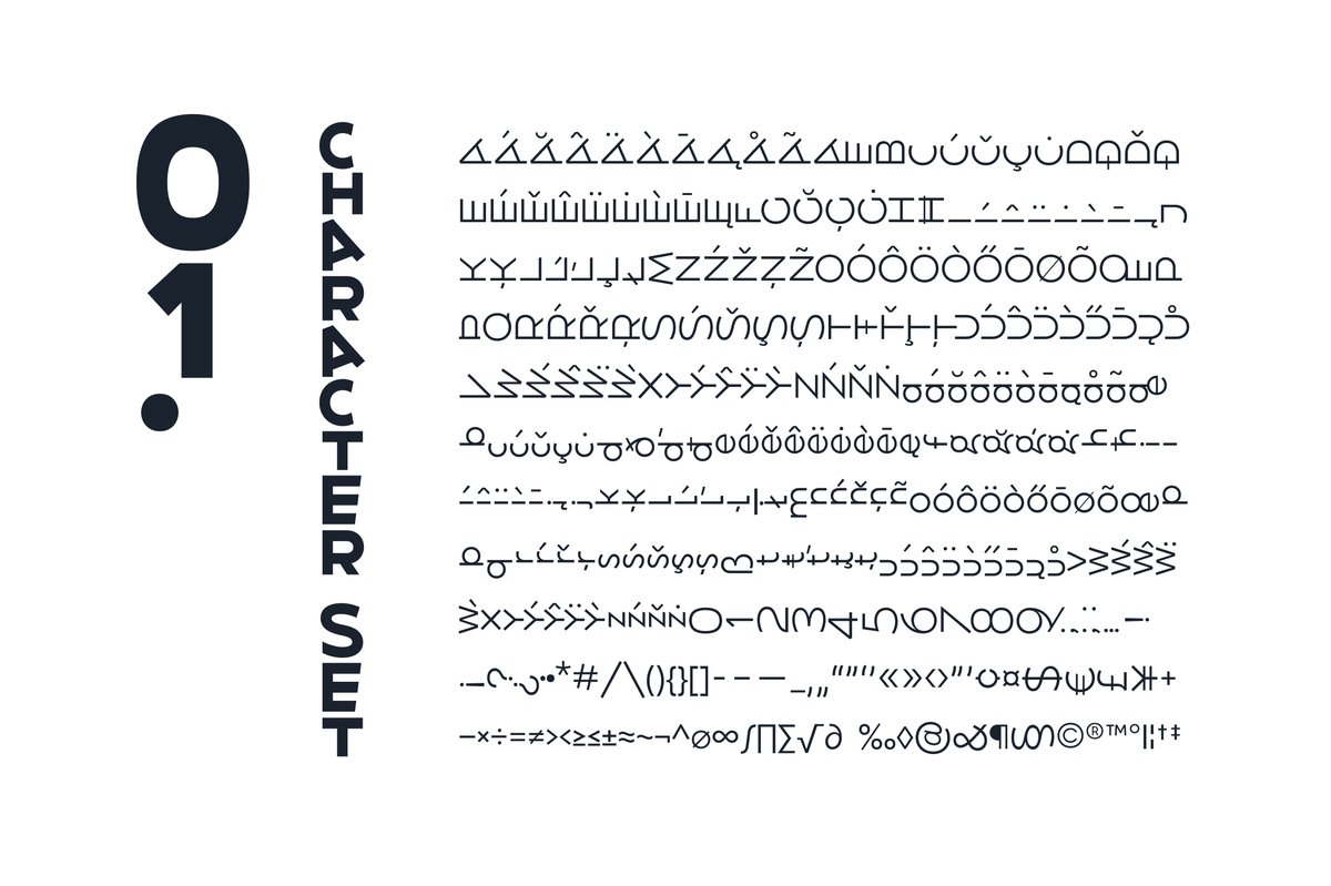
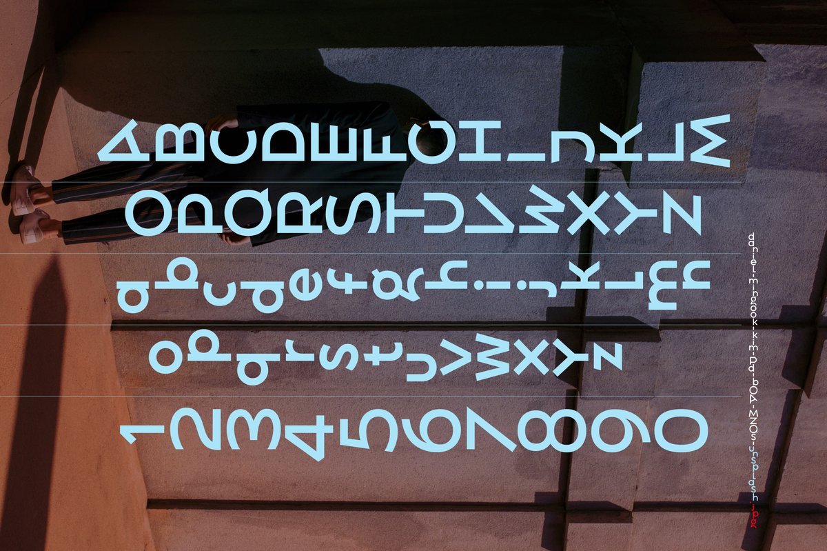
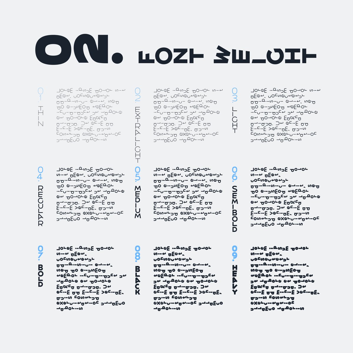
Revolancer is a postmodern geometric font with weights from Thin to Heavy. The turned letters are part of the drawing, so you don’t rotate anything yourself: set the word and the shapes do the work.
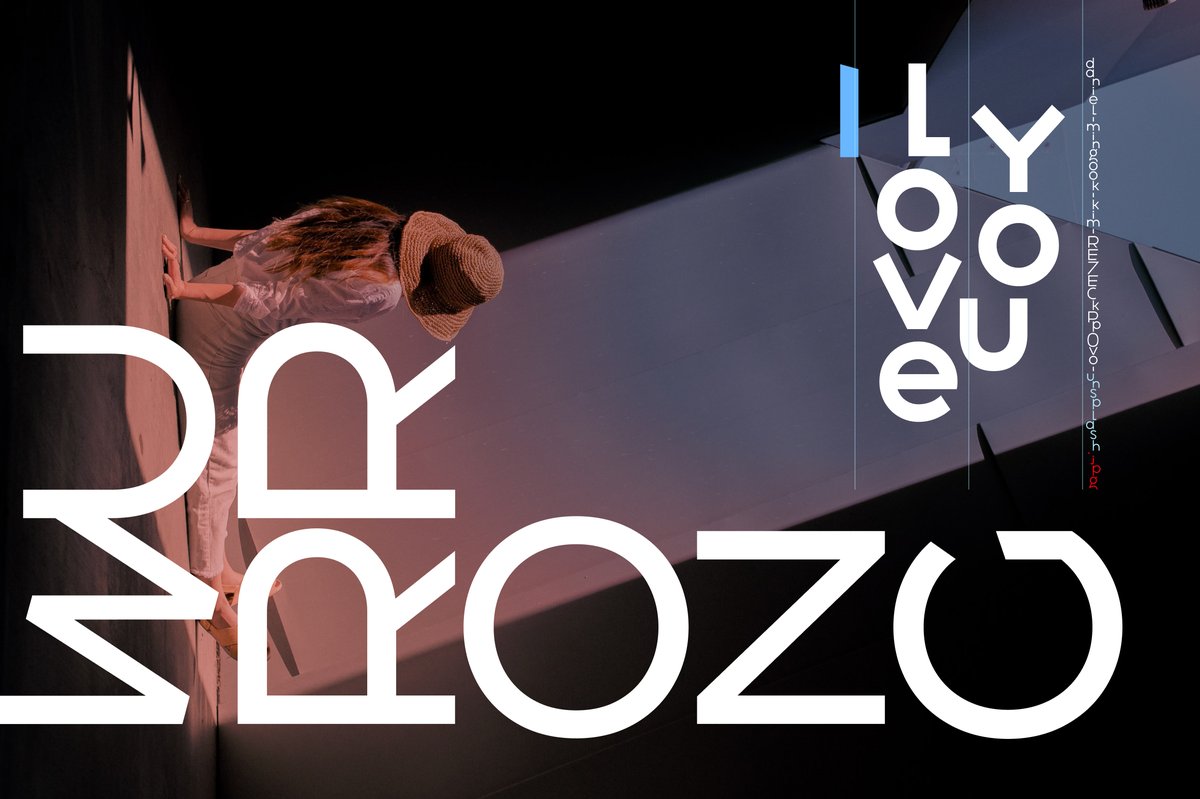
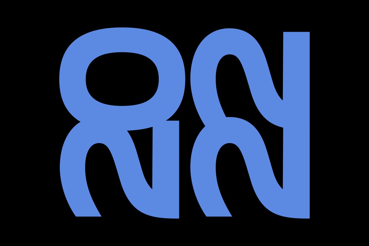
In the specimens the letters are a picture in their own right: a huge white “Murrozo” fills a photo of a woman against a wall, and two giant blue characters in wavy, flipped shapes fill a black panel.
Set only a name, a title or a slogan, because turned letters slow reading. For a gallery identity, use Heavy for the name and Thin for the address. For a club poster, stack the words and let the weights alternate. For a record sleeve, one word at a very large size can fill the cover.
For longer text, switch to Revolancer Pro, the same system without turned letters.