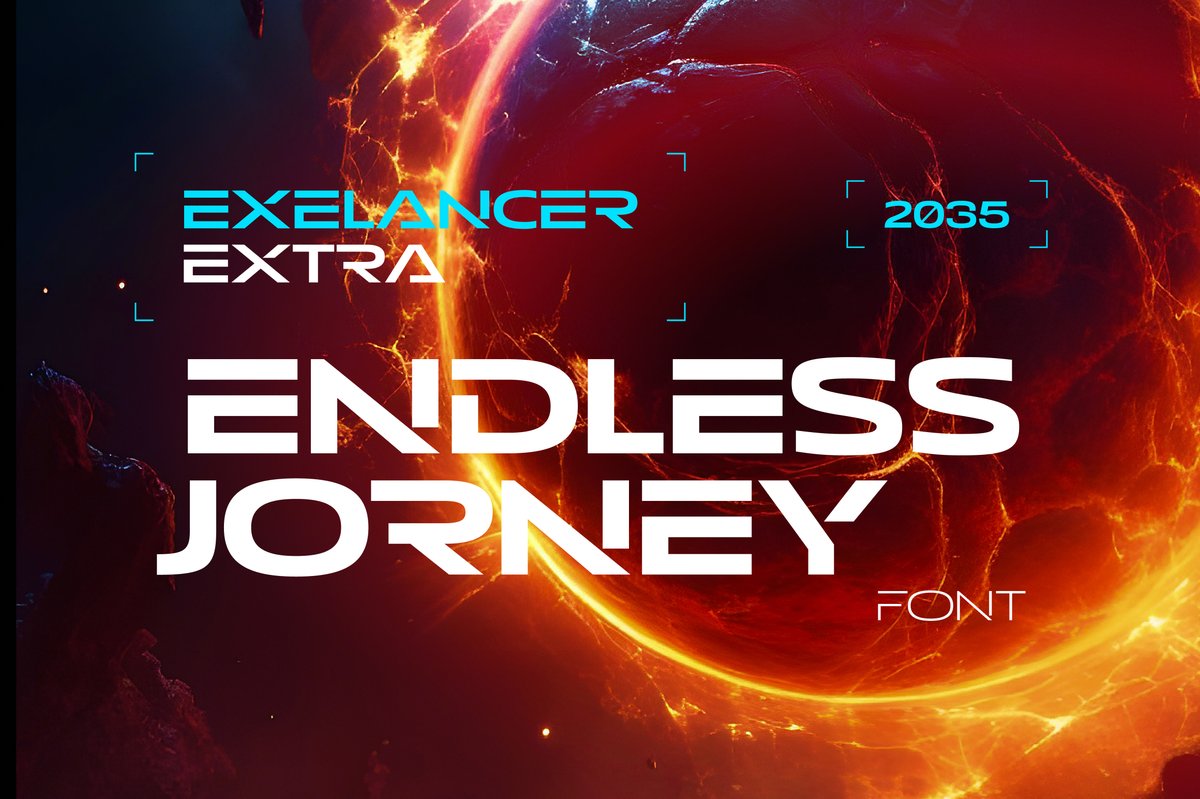
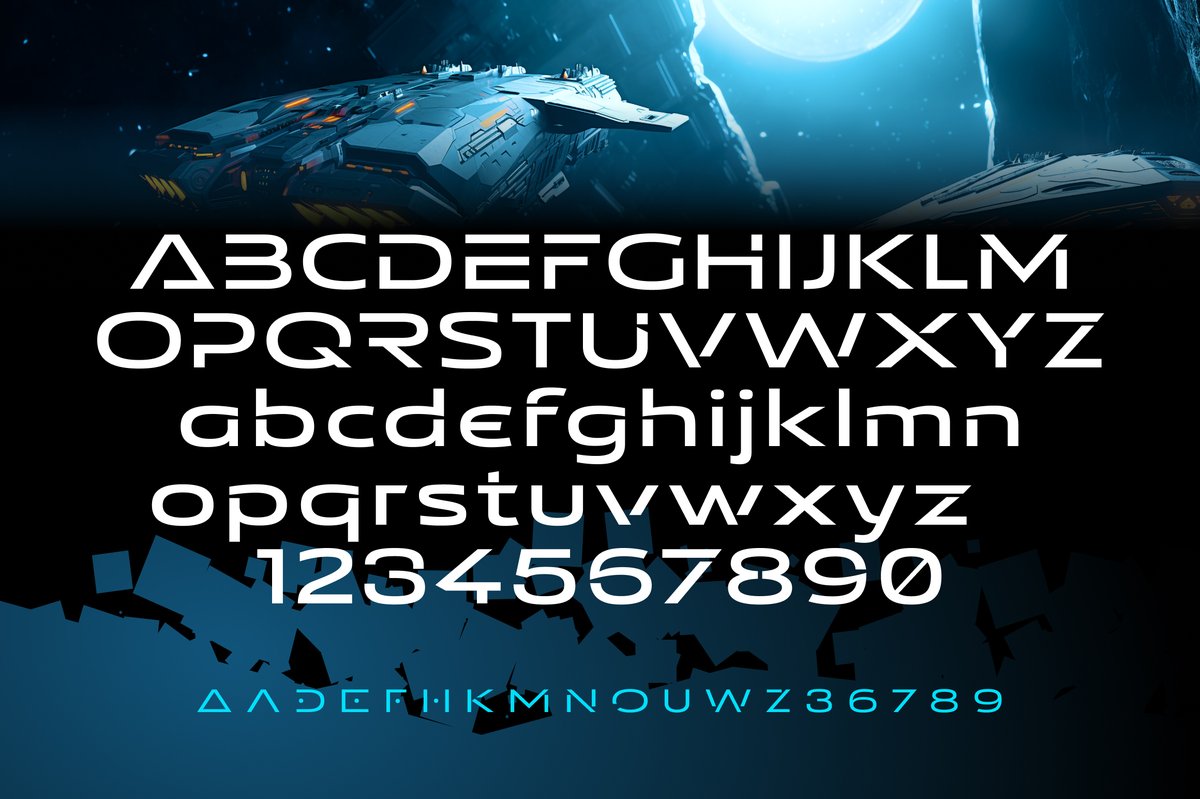
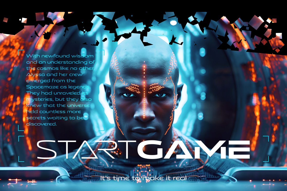
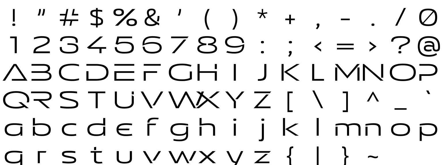
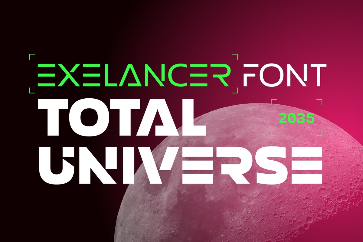
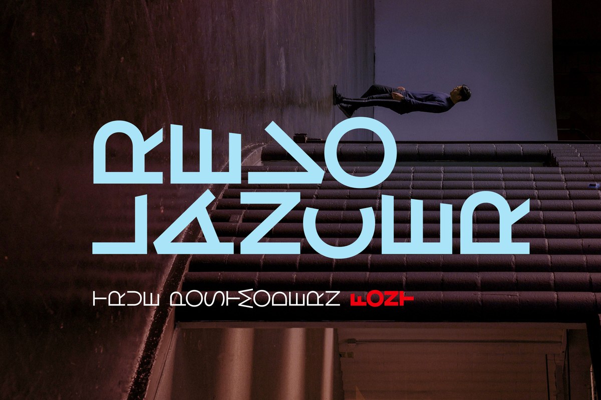
The Exelancer Extra font shares the space theme of Exelancer but spreads its letters wider. Use it for a game title screen, a space-themed event poster, a sci-fi book cover or an esports team badge. Set it next to Exelancer when one layout needs two styles that match.
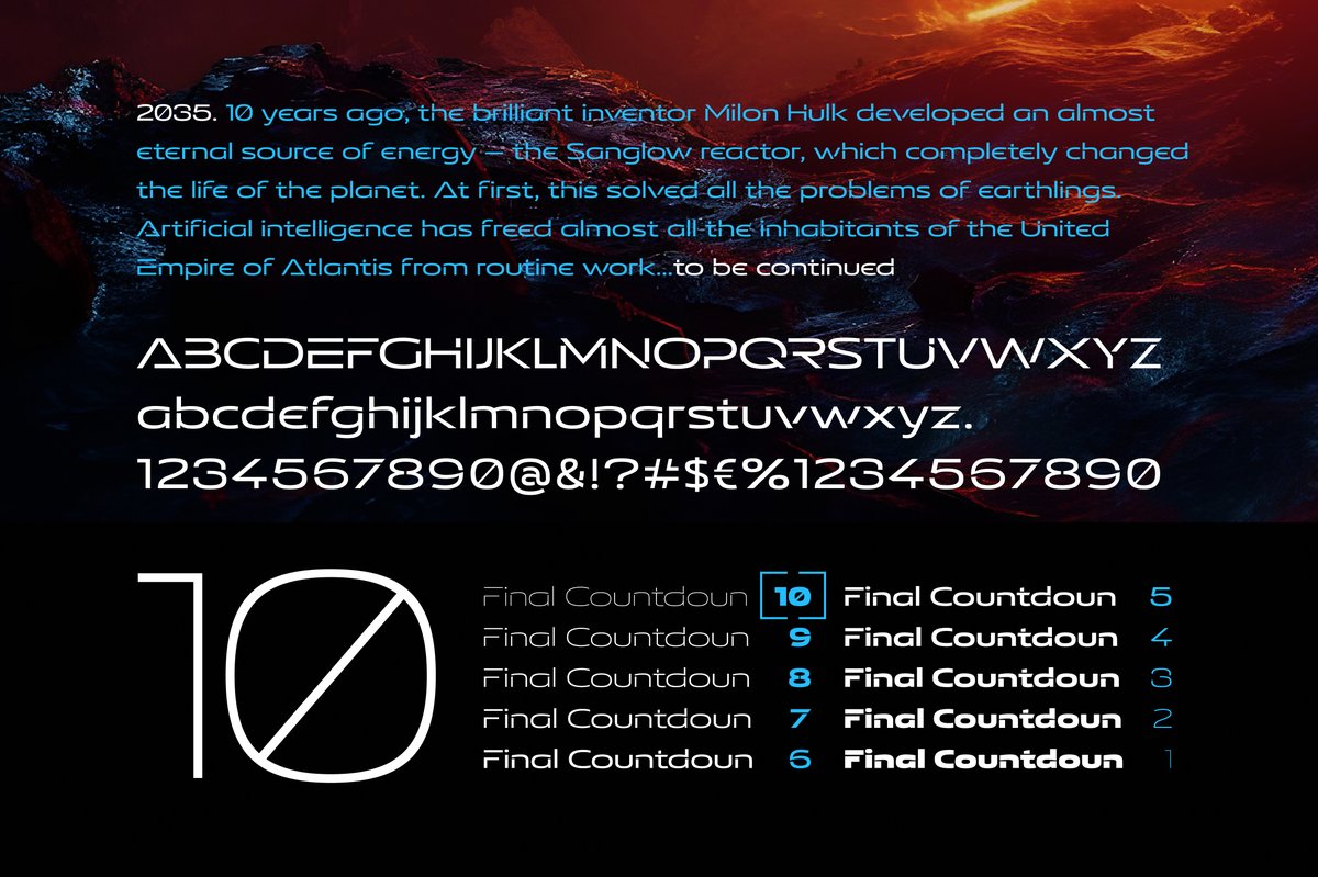
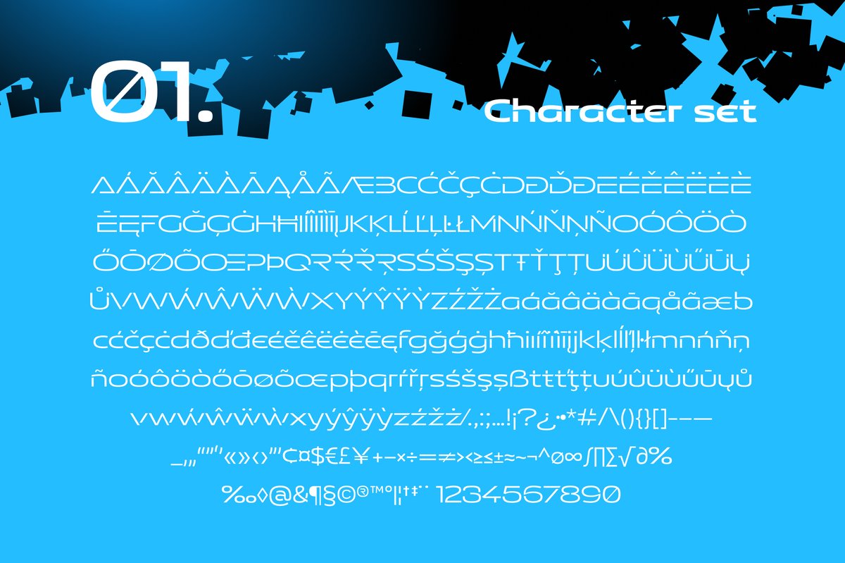
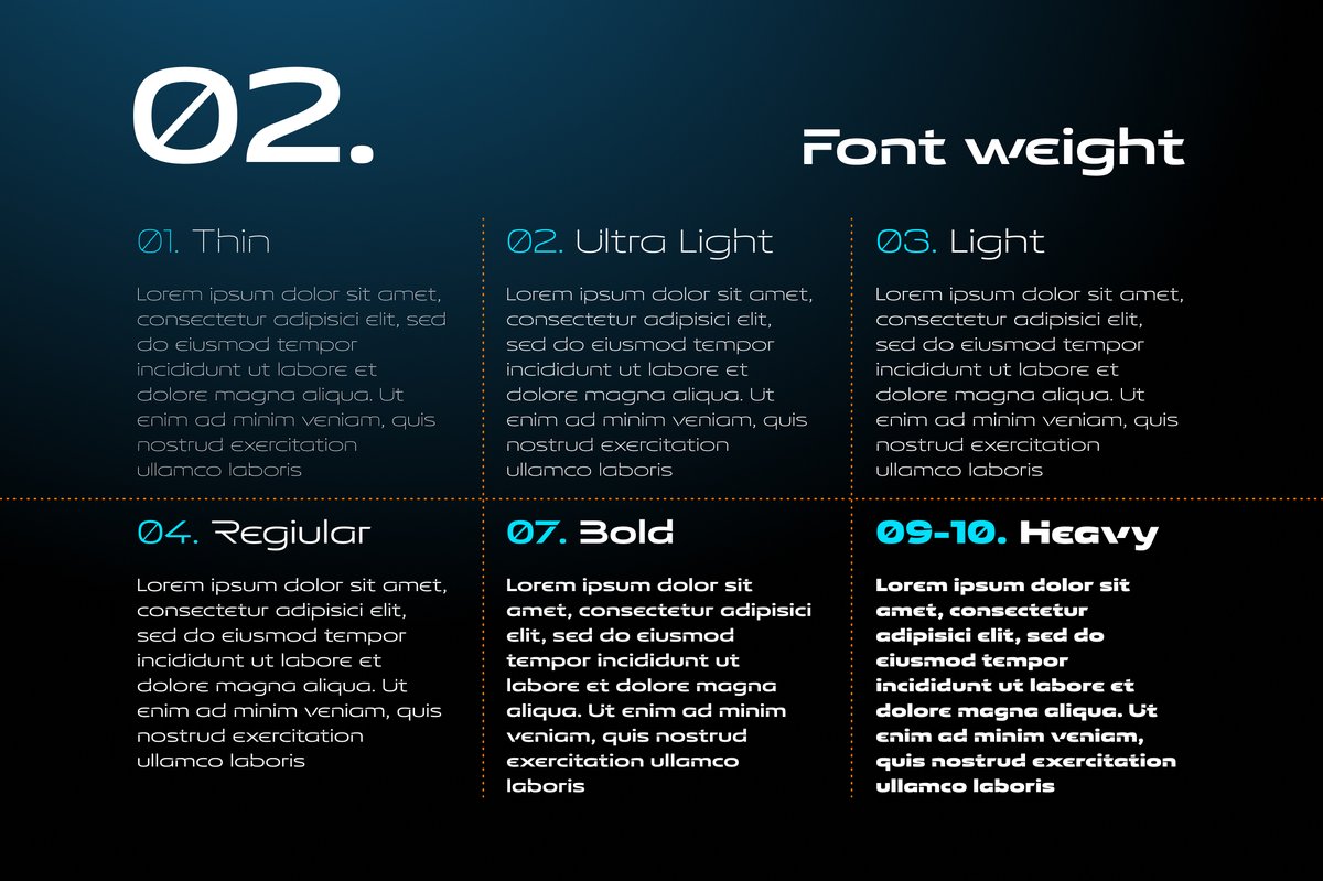
Exelancer Extra comes in ten weights, Thin to Heavy (Thin, ExtraLight, Light, Regular, Medium, SemiBold, Bold, ExtraBold, Black, Heavy), with alternate letter shapes for headlines. Its main trait is width: on a banner, a title screen or a team shirt the letters take a lot of horizontal room, and the line looks calm and technical rather than cramped.
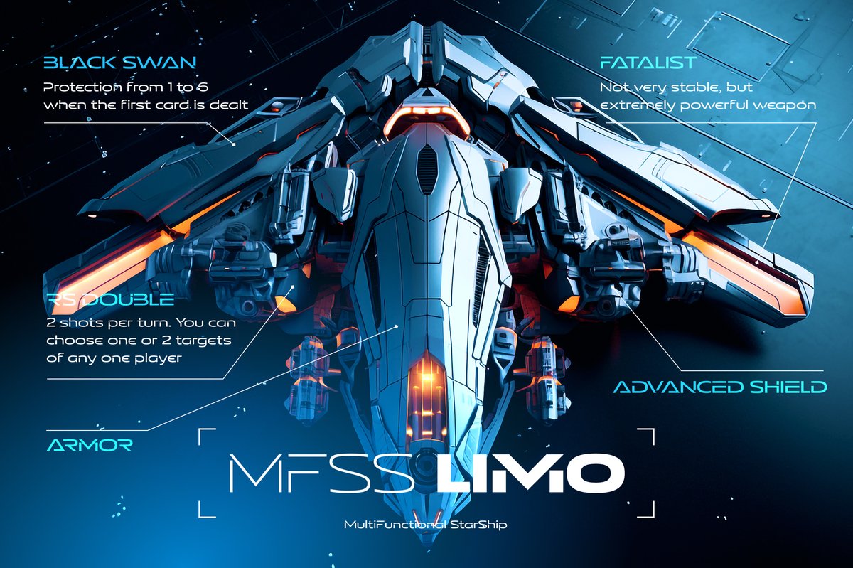
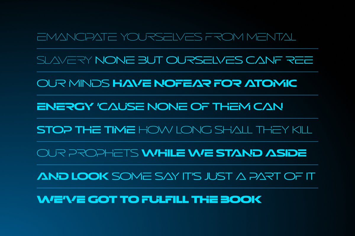
The specimens put it in sci-fi settings, such as a blue poster with a spaceship seen from above and a title that mixes a thin cyan weight with a heavy white one. The cyan-on-dark look suits a game interface, but the family also works in print.
For a book cover, set the title in Thin or Light with wide spacing and the author name in Medium. For an esports badge, use Heavy. For an interface, Regular and Medium keep small labels clear.
Exelancer and Exelancer Extra are the same design in two widths and are sold separately: Exelancer on MyFonts, Extra on Creative Market. Use Exelancer where space is tighter and Extra for banners and screens.