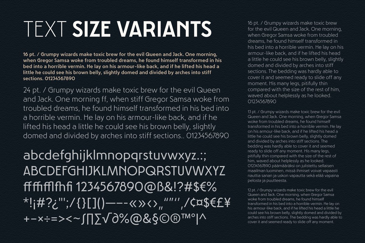
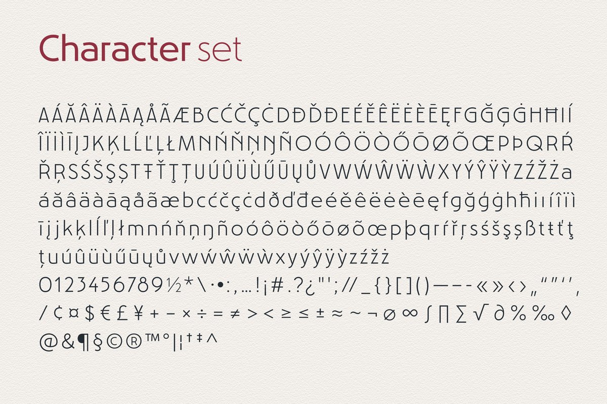
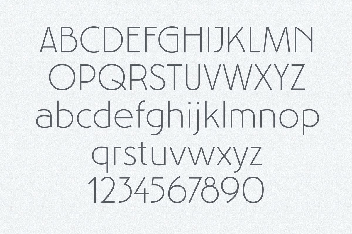
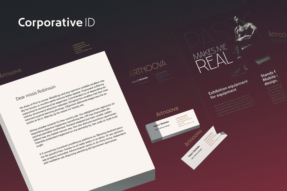
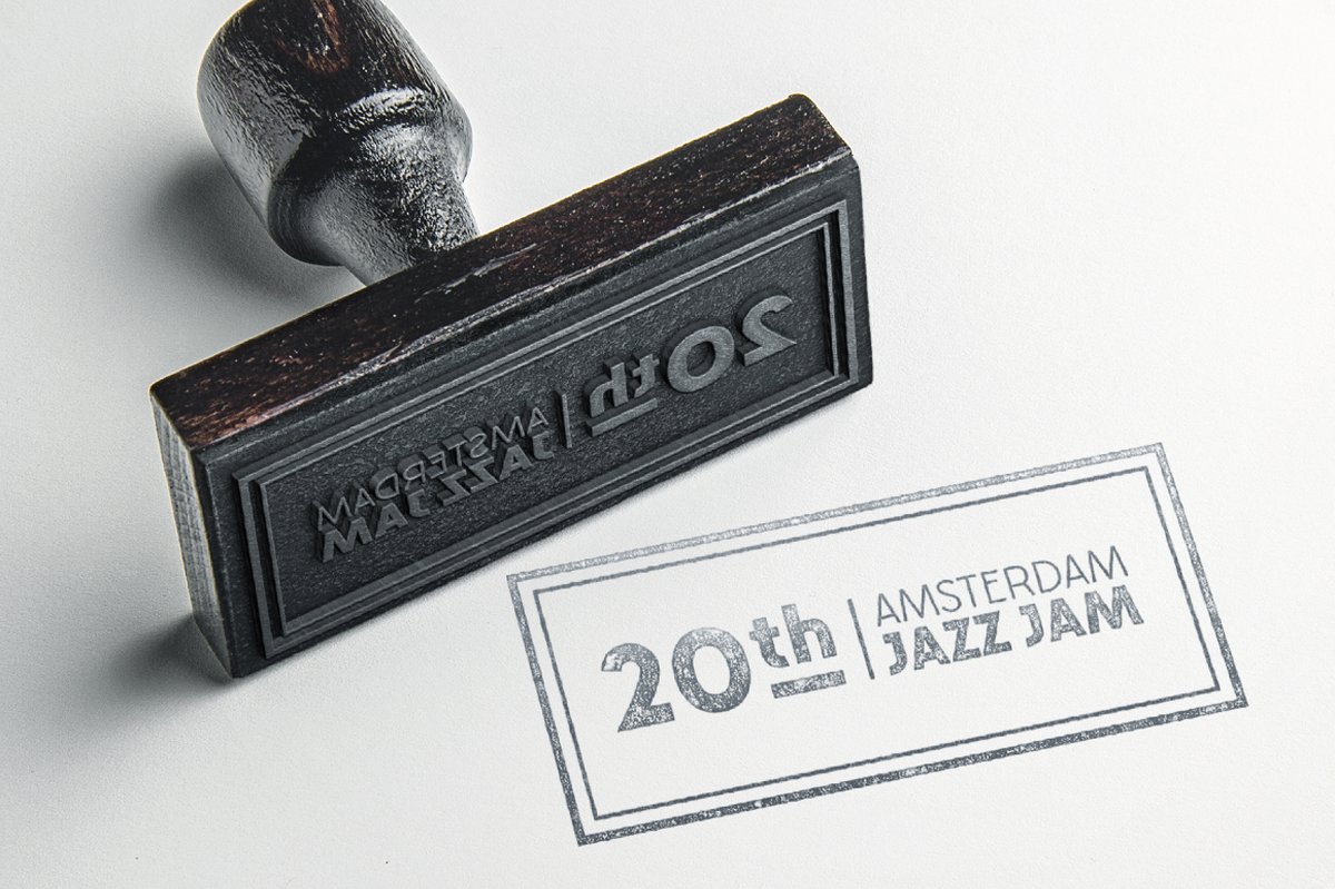
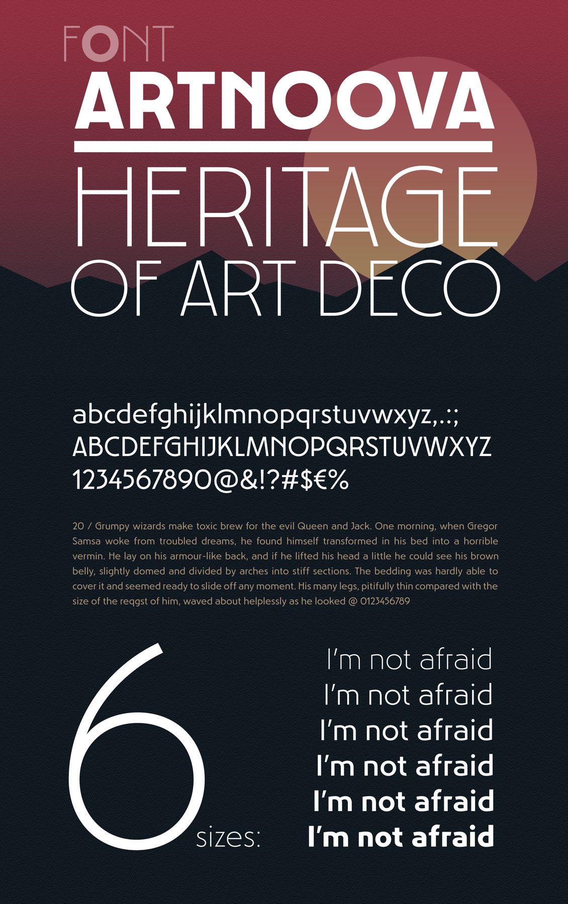
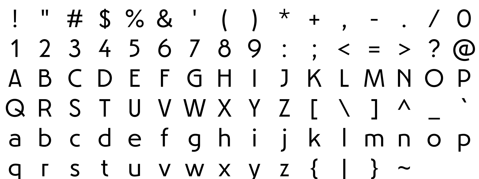
The Artnoova font takes its shapes from Art Deco and Art Nouveau lettering and keeps them light. Use it for a jazz-night poster, a wine or perfume label, a hotel or salon logo, or a book cover with a period feel. The details come through at large sizes, so set titles big and give them room.
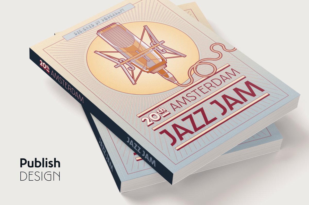
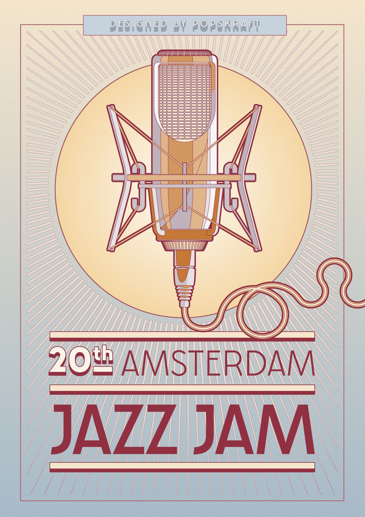
Artnoova leans on the 1920s side of that mix. The specimens show period scenes, such as a travel poster with a plane and a jazz-night poster with a studio microphone in a golden circle, and treat the type like a decorated sign: tall thin capitals, space around them, one accent color.
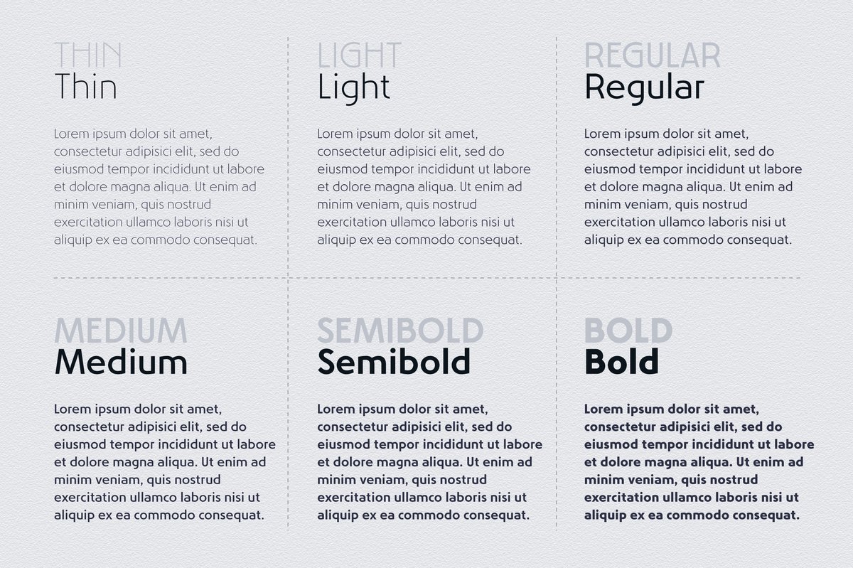
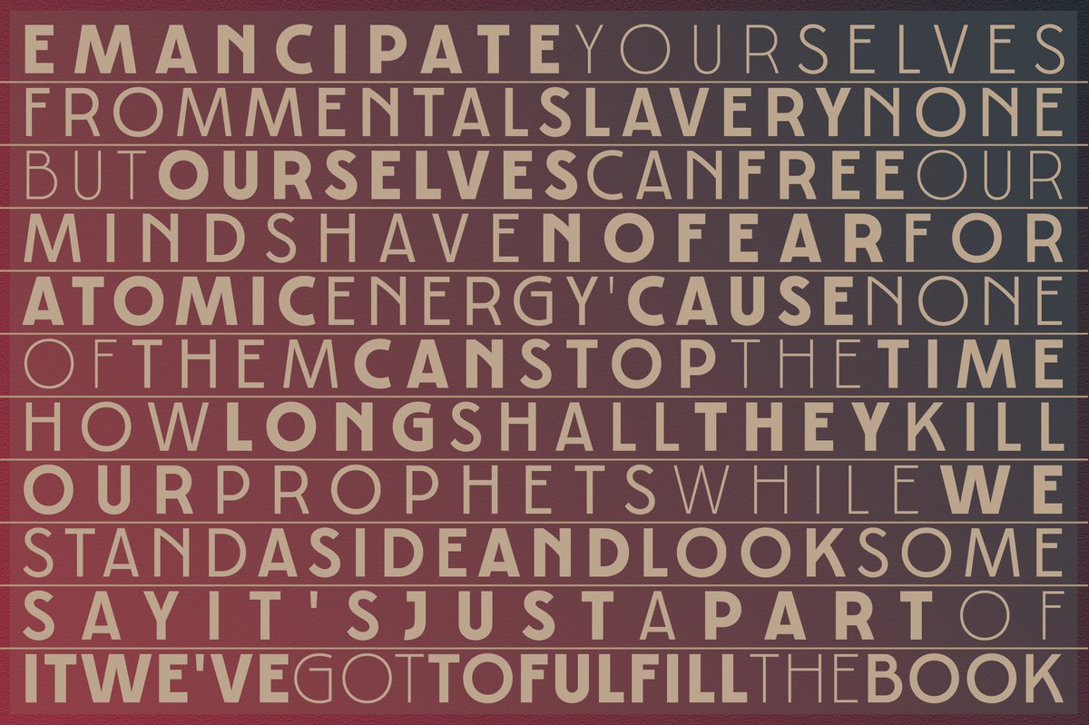
The family has two parts. Artnoova is the standard set, in six weights from Thin to Bold (Thin, Light, Regular, Medium, Semibold, Bold), each with an italic. Artnoova MS is monospaced, so every letter takes the same width, and has the same weights and italics. That is handy for a menu, a ticket, a price list or a label with columns, and it adds a typewriter touch to a Deco layout.
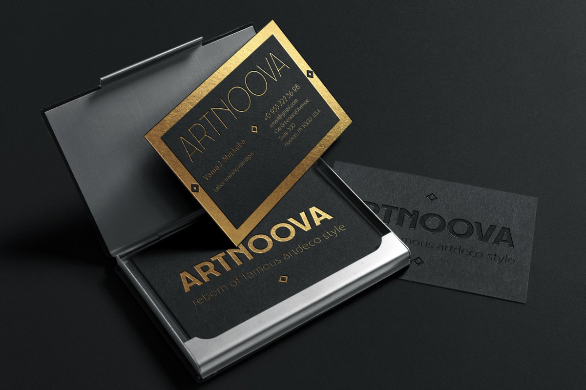
For a vintage poster, set the headline in Thin capitals, date and place in Regular, credits in Medium. For a logo, Light capitals with wide spacing and a thin rule. Thin strokes need size, so on a small label step up to Regular or Medium.
AlterGlam is a wide sans in a similarly elegant mood and can carry the small text under a Deco title.