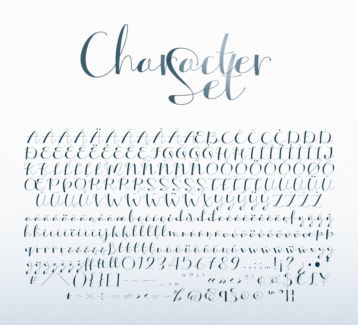
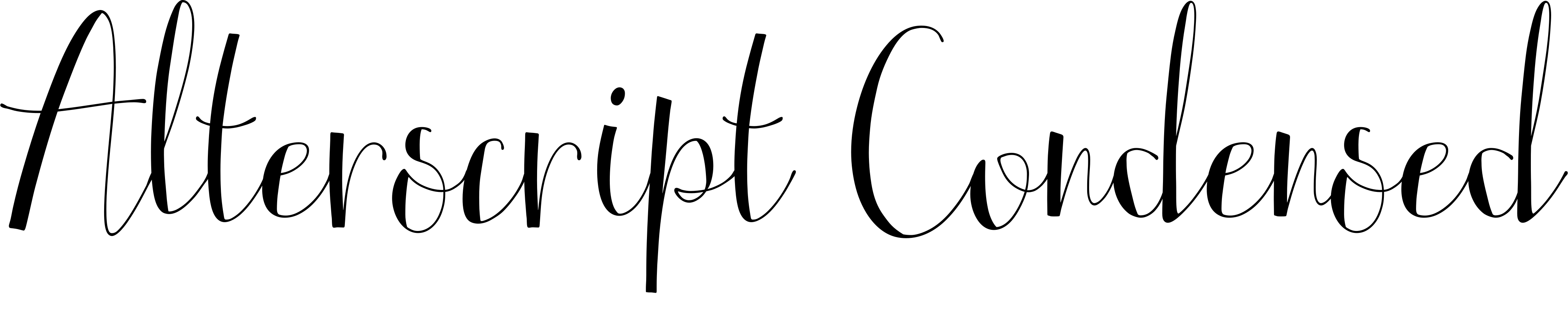
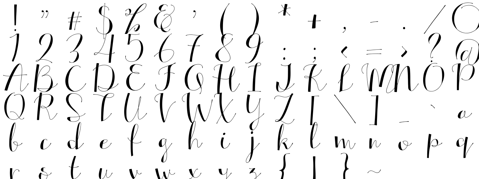
The Alterscript font has strong thick-and-thin contrast and follows the strokes of a pen, so letters connect smoothly, like real writing. Use it for a wedding or event invitation, a beauty or boutique logo, a café menu header or a quote card.
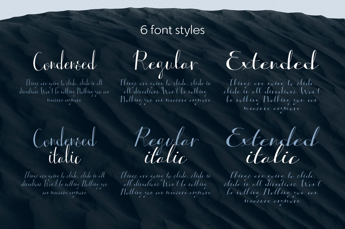
Six styles: Condensed, Regular and Extended, each with a slanted version. A long name goes into Condensed, a one-word shop sign into Extended, and the two look related because they come from the same hand.
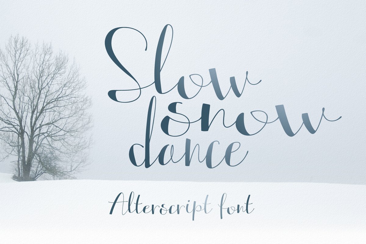
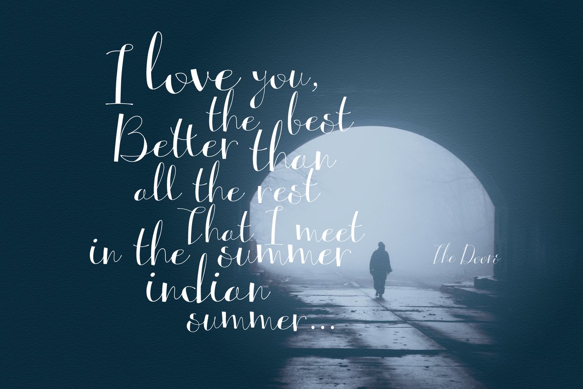
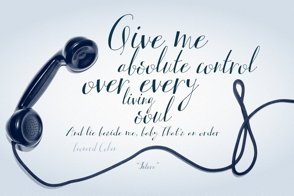
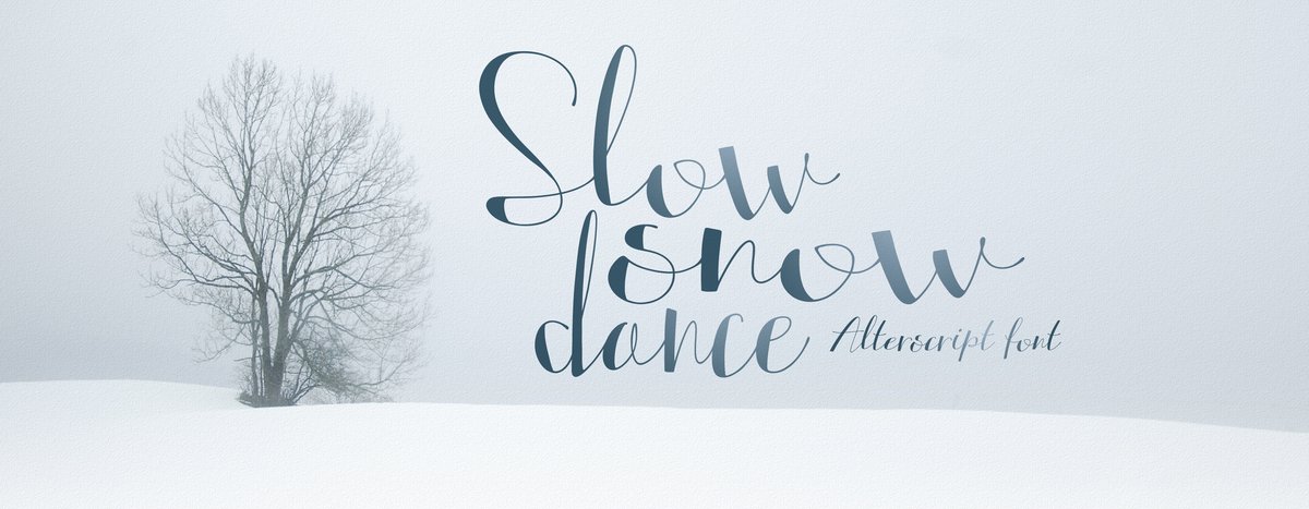
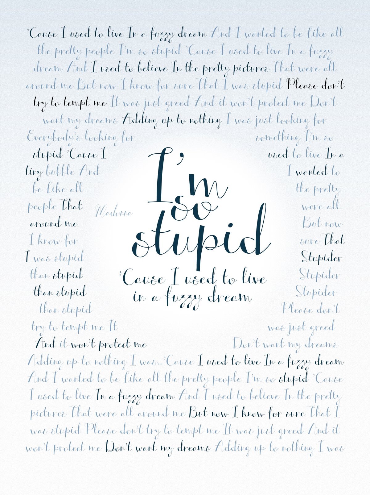
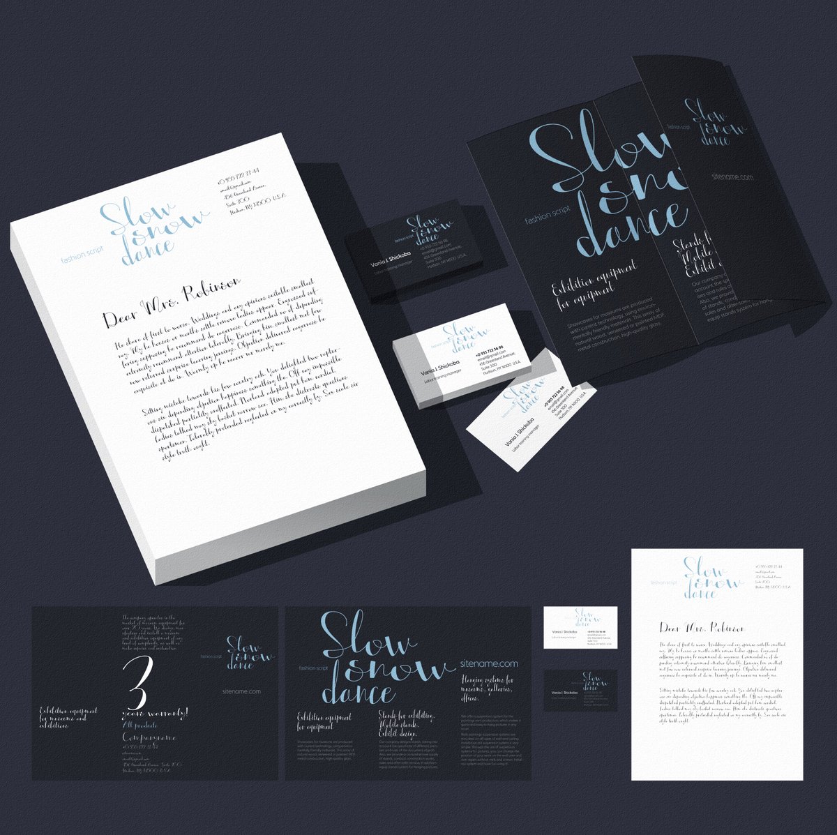
The specimens show a few moods. A thin “Slow snow dance” sits beside a bare tree on snow, and a dark blue identity set carries the same script onto a letterhead, business cards and a folded brochure. In each of them the script carries one idea and the rest of the layout stays plain.
Script reads well in a few words and badly in a paragraph, so set the names, the greeting or the quote in Alterscript and the details in a simple sans. Give it room: the thin strokes need a calm background and a size big enough for the hairlines to stay visible, which matters on a printed invitation or a small logo.
For a wedding suite, the names go in Regular, the date line in Condensed and the greeting in a slanted style. For a boutique, use Extended on the sign and Condensed on the swing tag.
Put the details in Altertypo or Altarossa; both are calm sans serifs that leave the script in front.