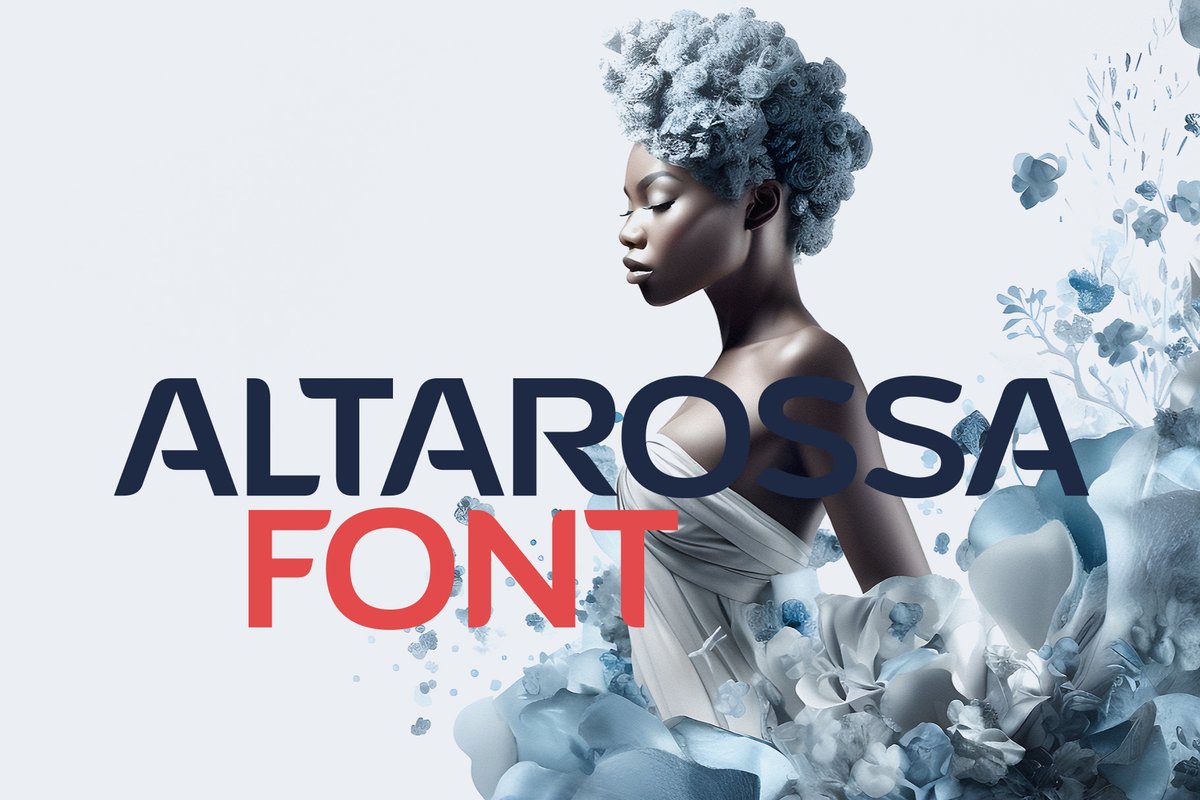
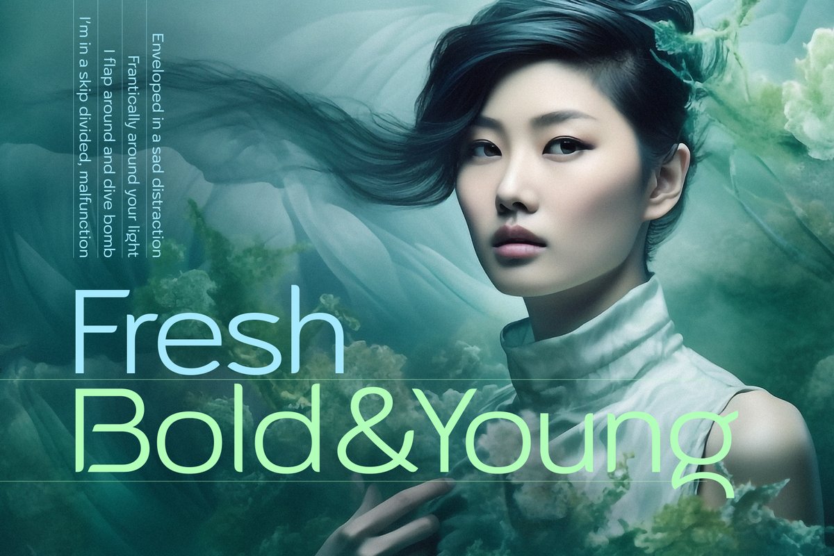
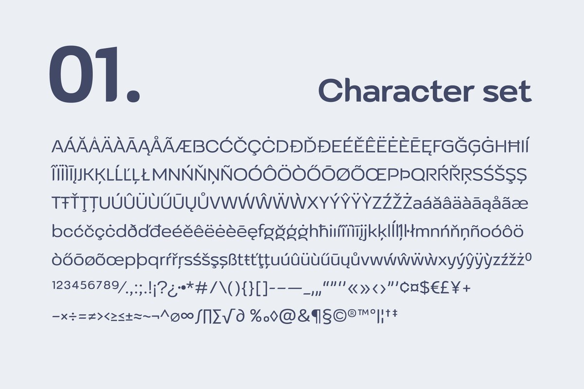
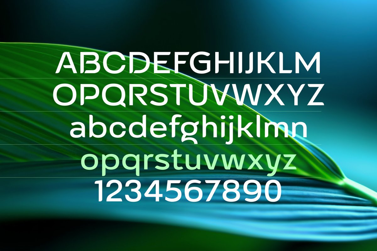
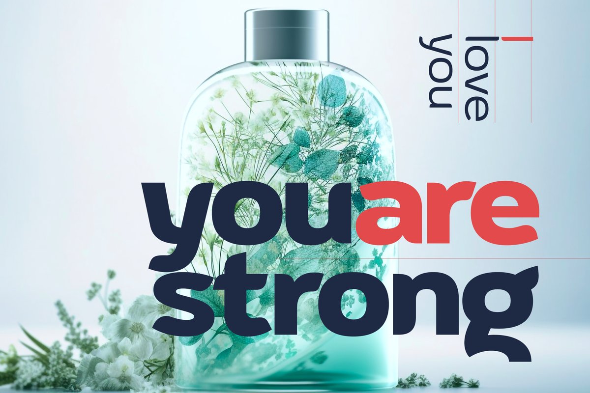
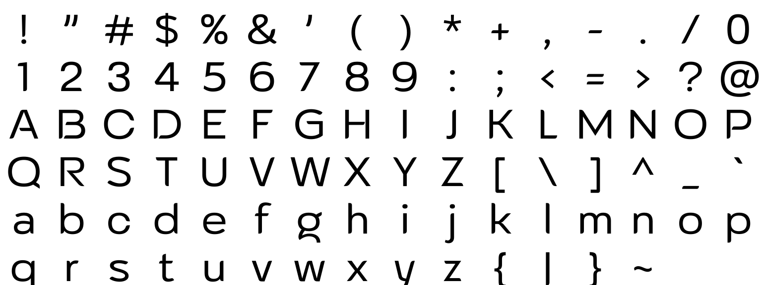
The Altarossa font pairs classic sans shapes with softened corners, so it looks friendly without turning childish. Use it for cosmetic packaging, a skincare logo, a fashion lookbook cover or a magazine headline. Light weights suit labels and captions; heavy ones suit a short brand name.
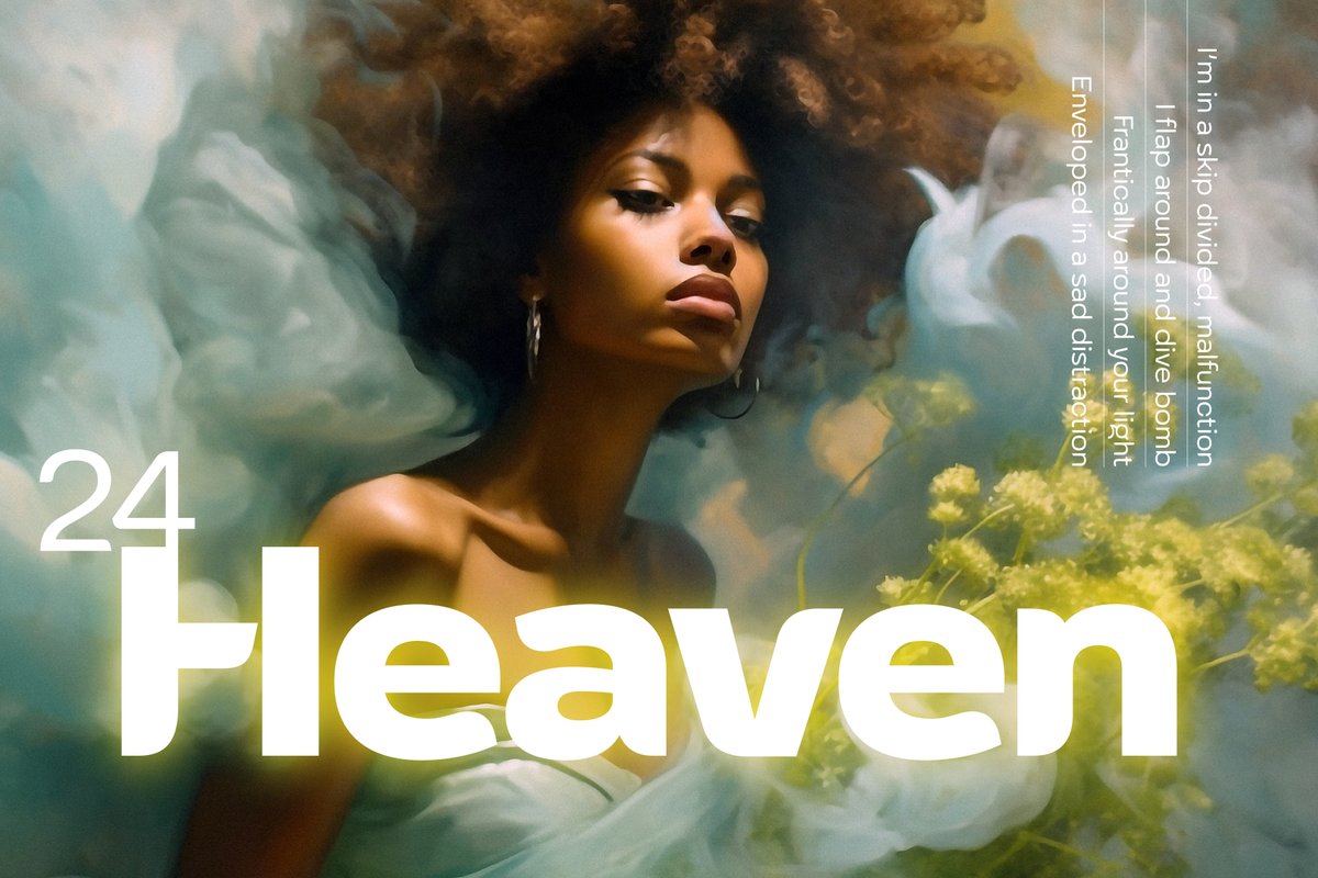
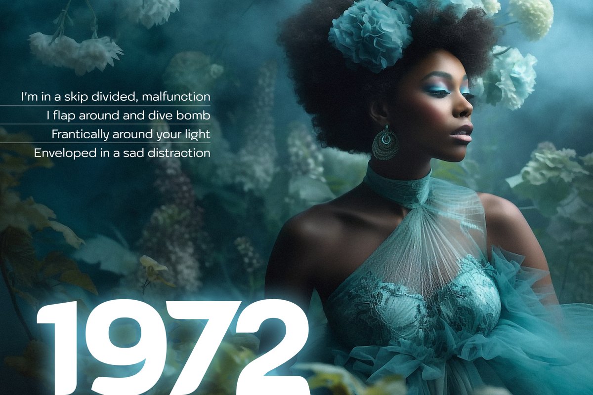
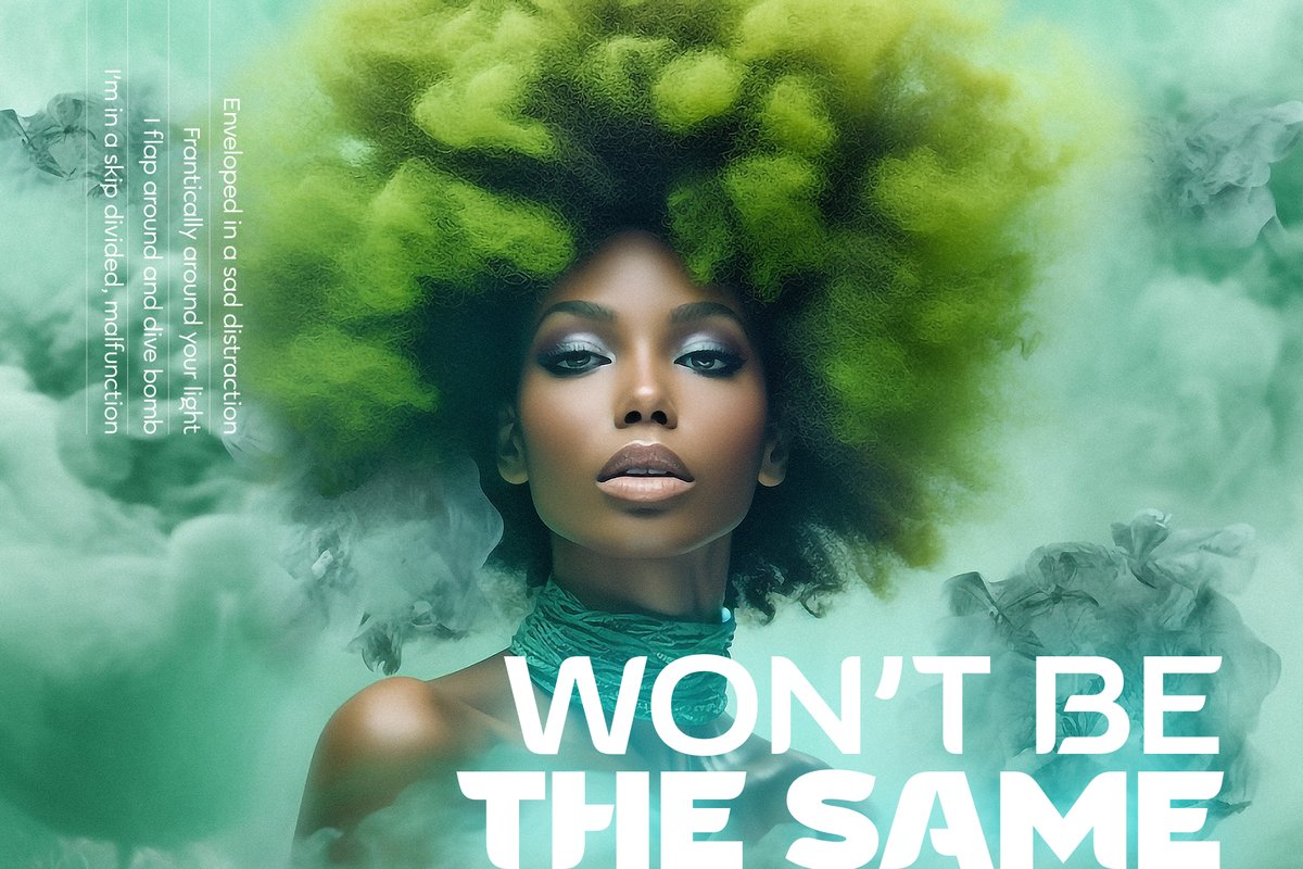
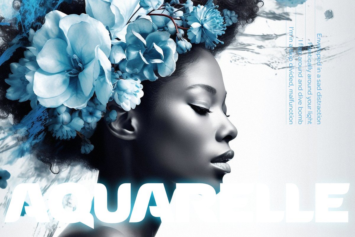
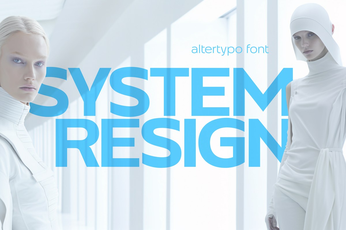
Altarossa suits layouts where a photo does the talking: set one word large over a portrait or a flower close-up and let the picture carry the rest.
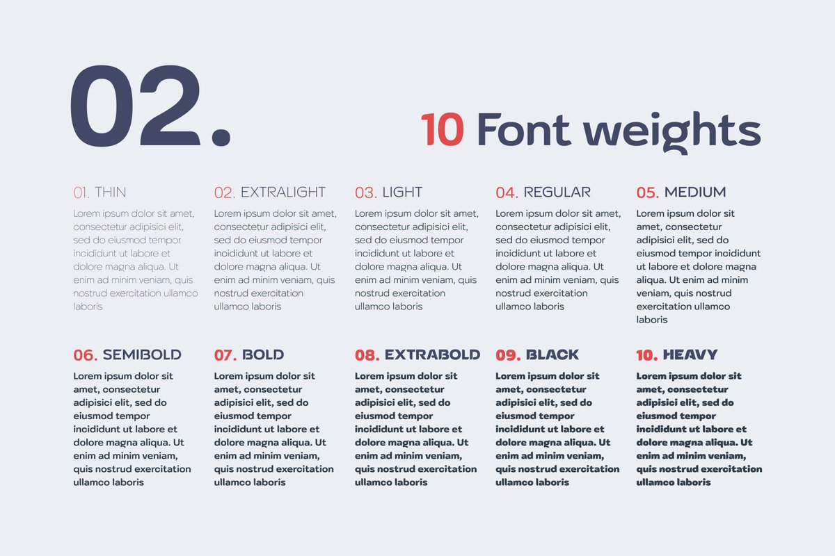
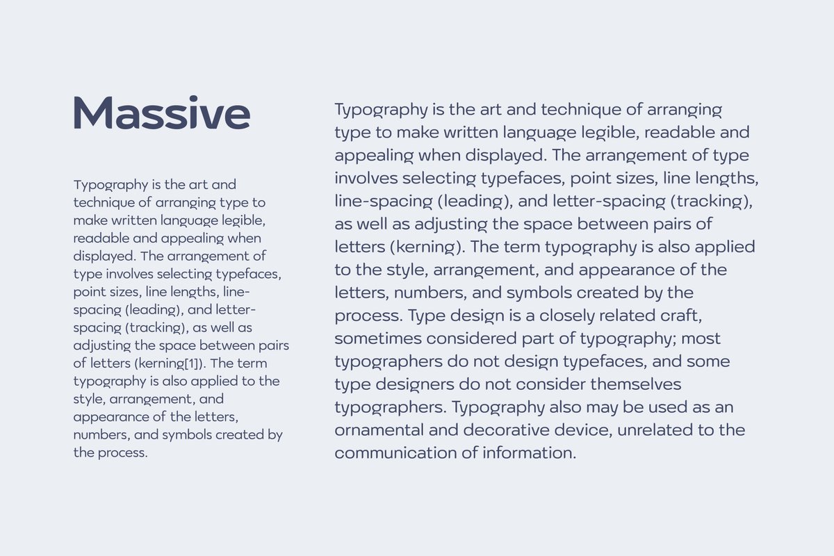
The ten weights run Thin, UltraLight, Light, Regular, Medium, SemiBold, Bold, ExtraBold, Black and Heavy. Put a brand name in Bold and its tagline in Thin in the same line, and the two get their own levels without a second font. Thin is the elegant choice for a large title; Regular and Medium are for paragraph text, and one specimen sheet shows two columns of it so you can judge the rhythm before you buy.
A beauty or fashion job is made of many small pieces: a logo, a box front, a tag, a caption, a printed catalog. Use Heavy for the product name, Light for the ingredient line, and keep all caps for short lines only.
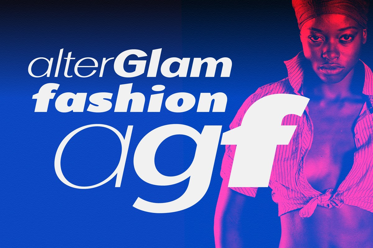
For a signature-style line on a label, pair it with Alterscript; when a layout needs a wider cut, AlterGlam is the sibling in the same calm mood.