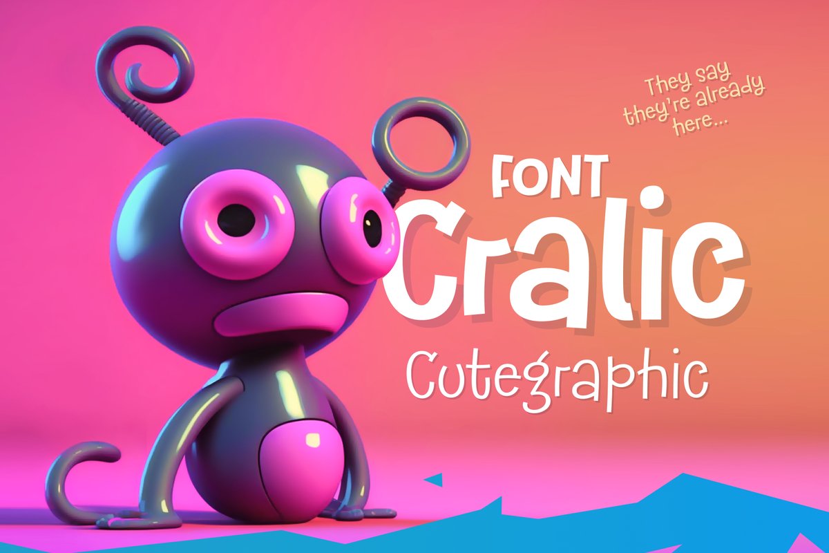
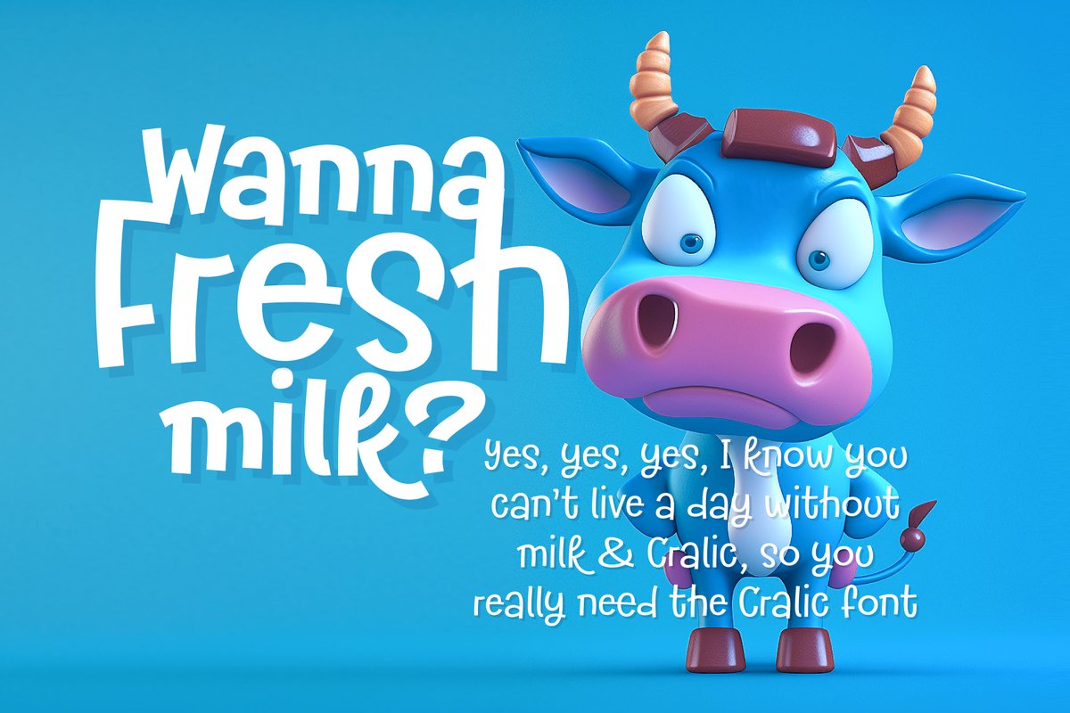
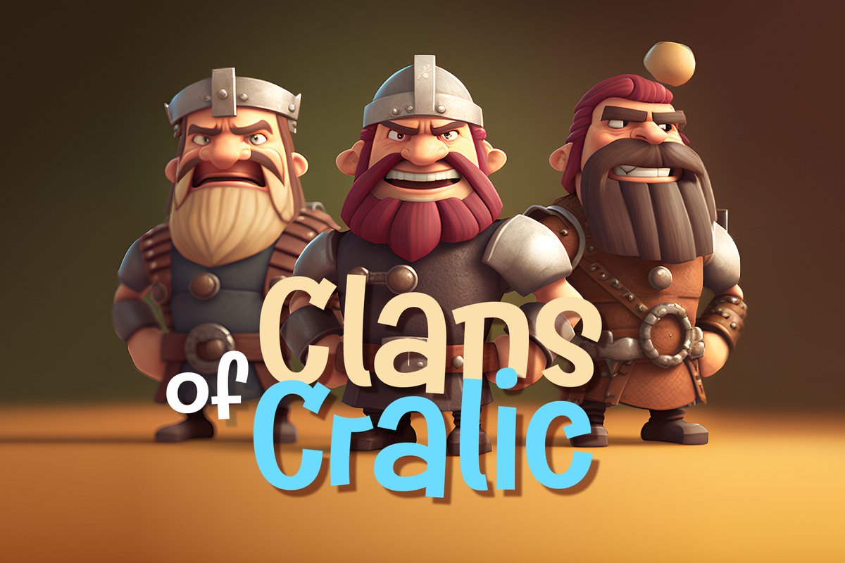
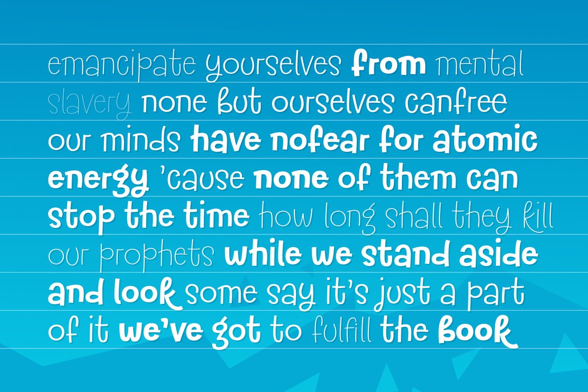
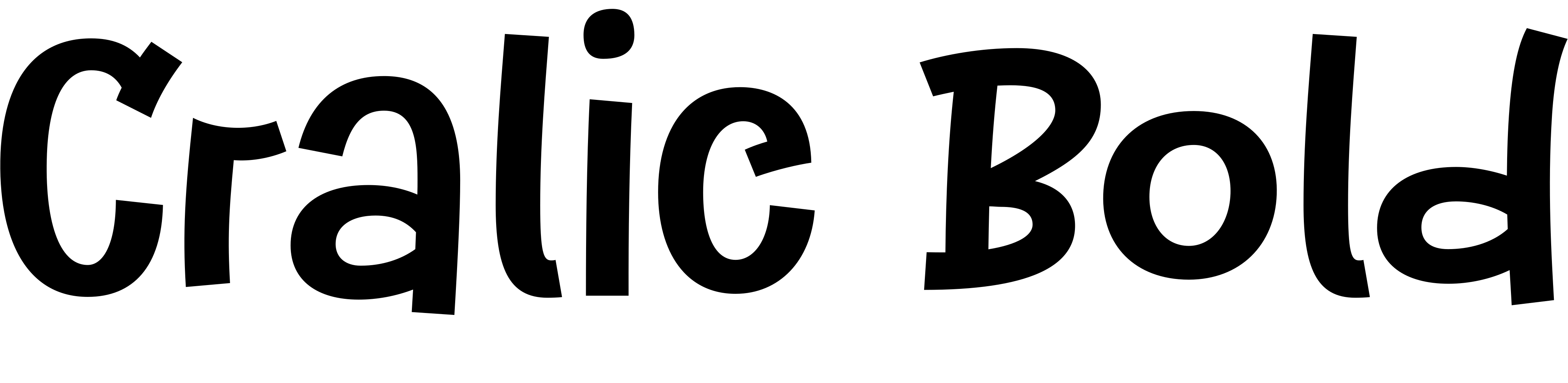
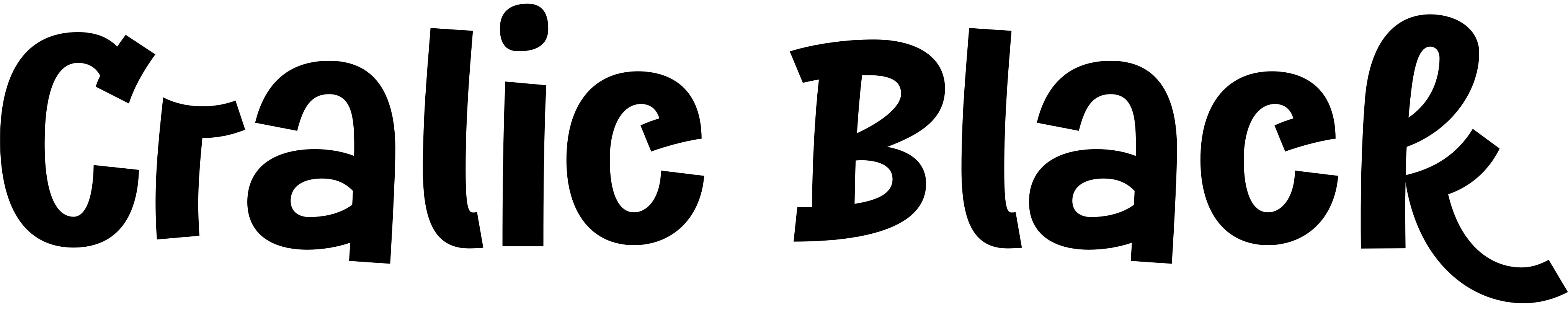
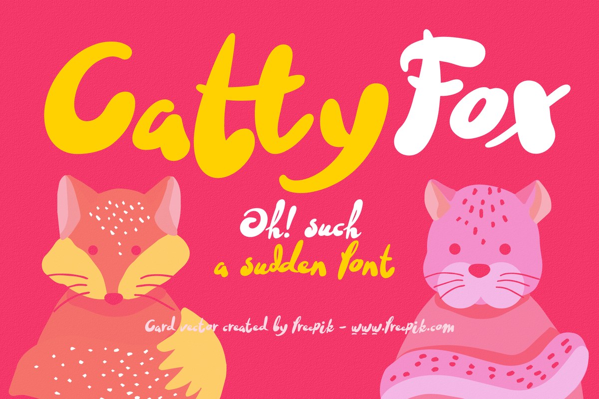
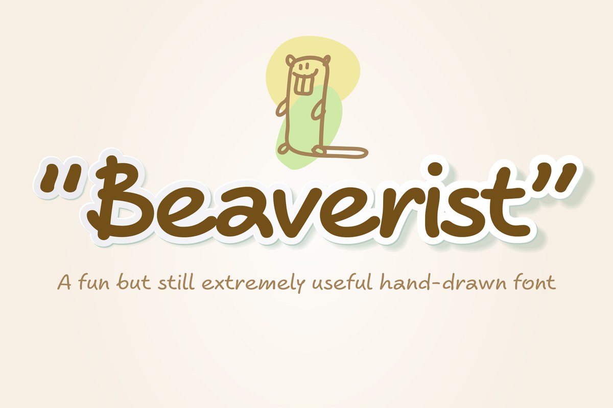
The Cralic font has slightly uneven, tilted shapes that feel drawn by hand. Use it for a mobile game logo, a cereal or toy box, a pet-brand post or a party invitation. Light weights suit captions; heavy ones make a sticker-like headline.
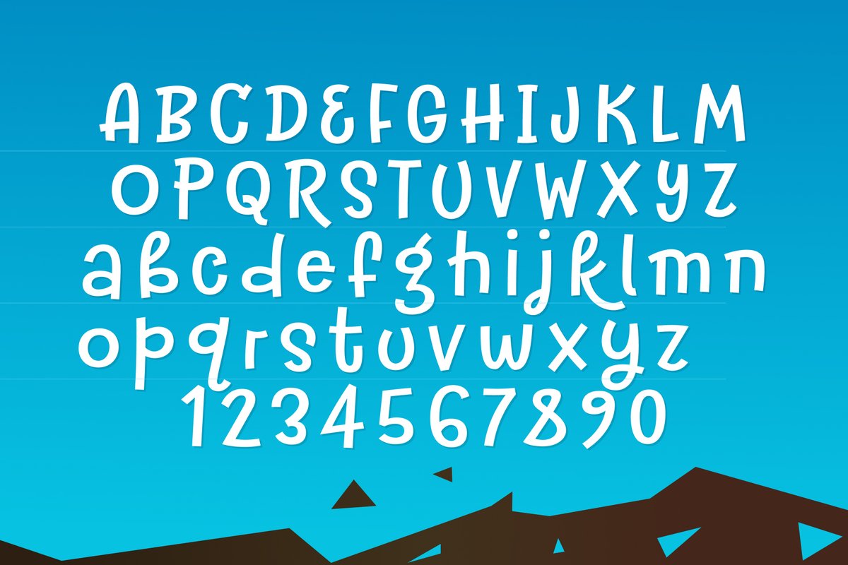
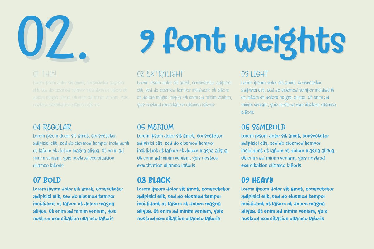
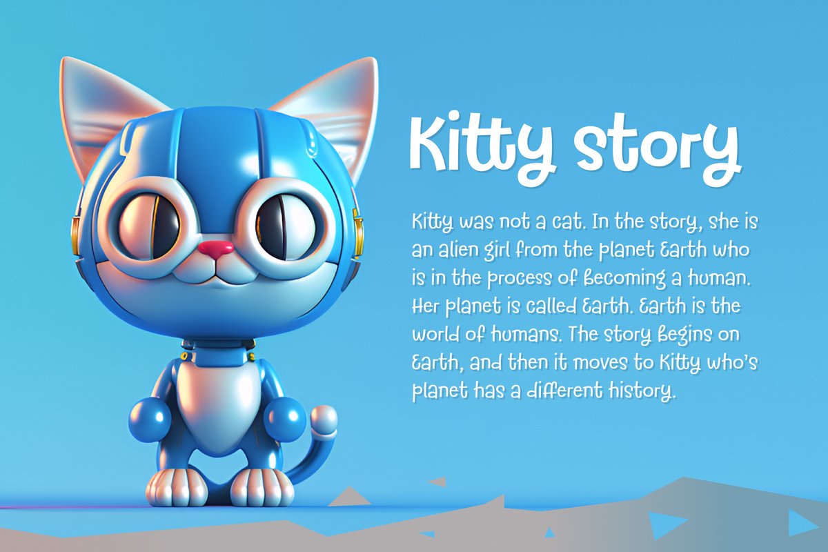
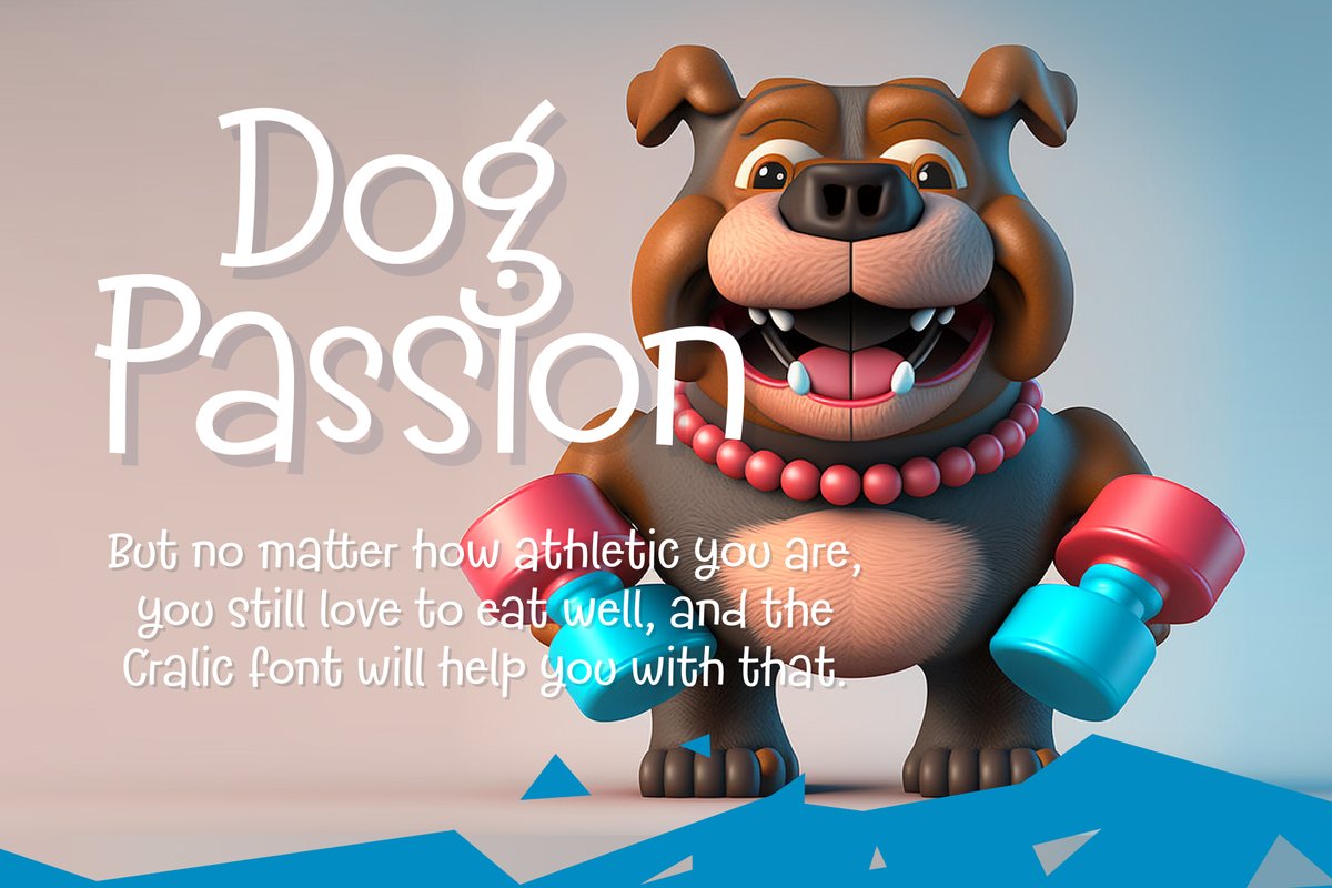
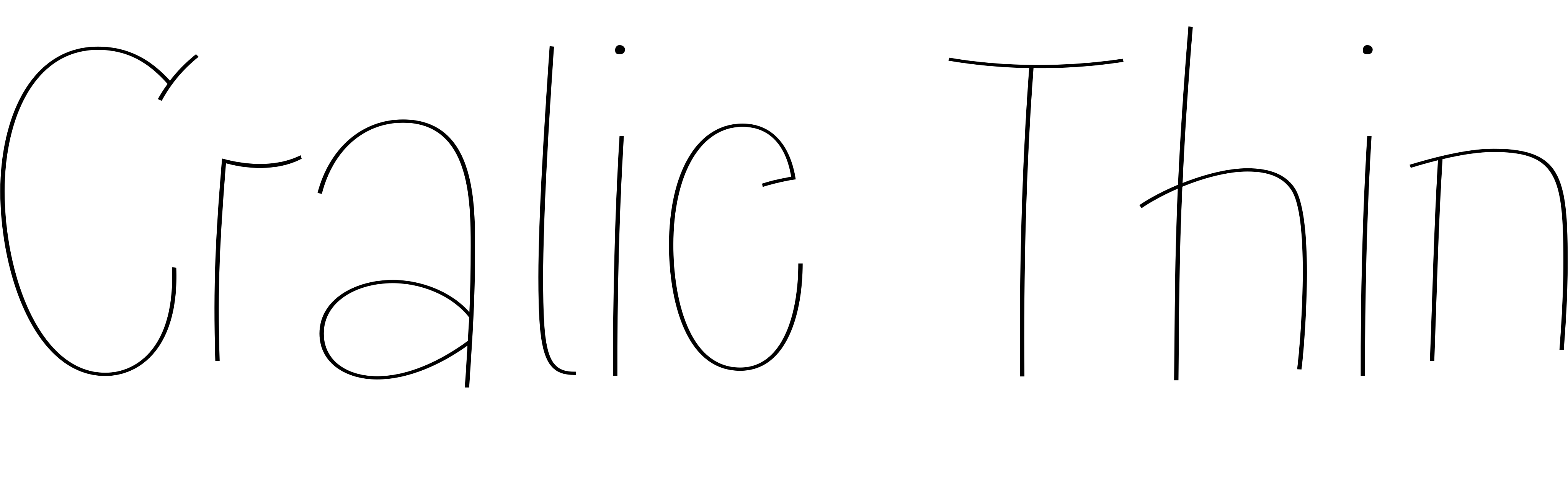
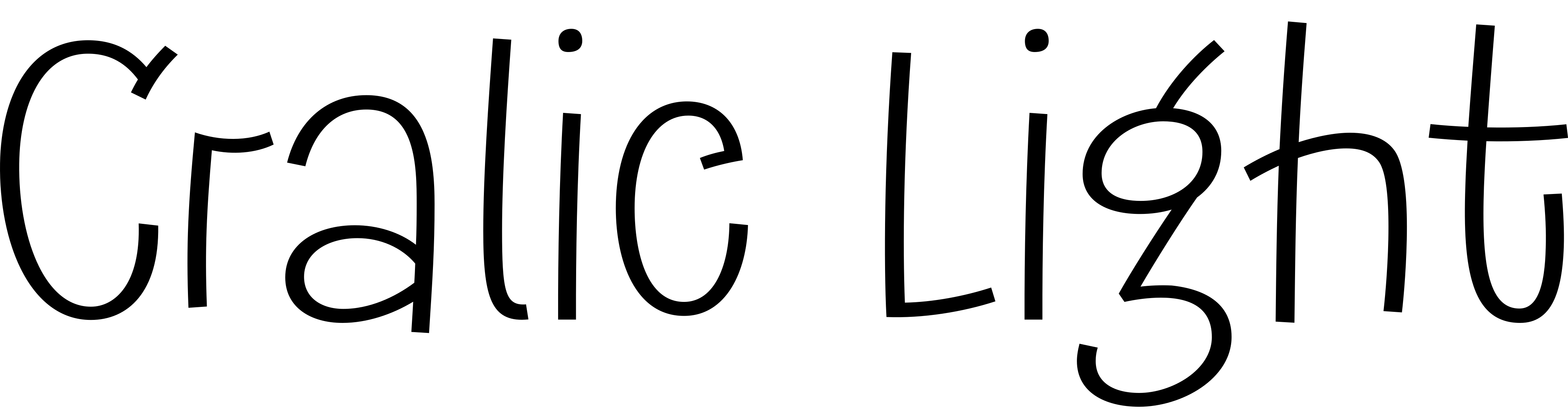
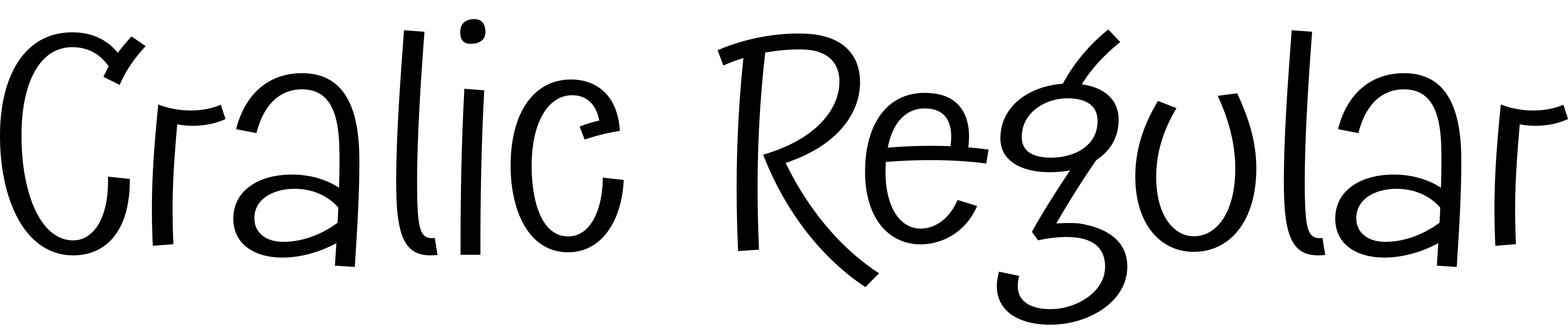
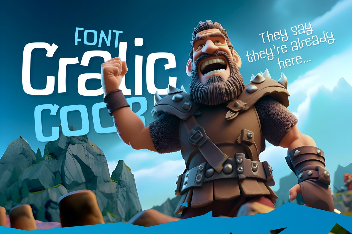
Cralic is a cartoon font in nine weights (Thin, ExtraLight, Light, Regular, Medium, SemiBold, Bold, Black, Heavy) with alternate letters. The specimens use cartoon robots, animals and vikings on saturated color, with white or cream letters on deep blue, pink or orange for strong contrast.
For a game, set the logo in Heavy and the menu items in Medium. For a cereal or snack box, put the flavor in Heavy and a short line in Regular. A party invitation can use Bold for the child’s name and Light for the details.
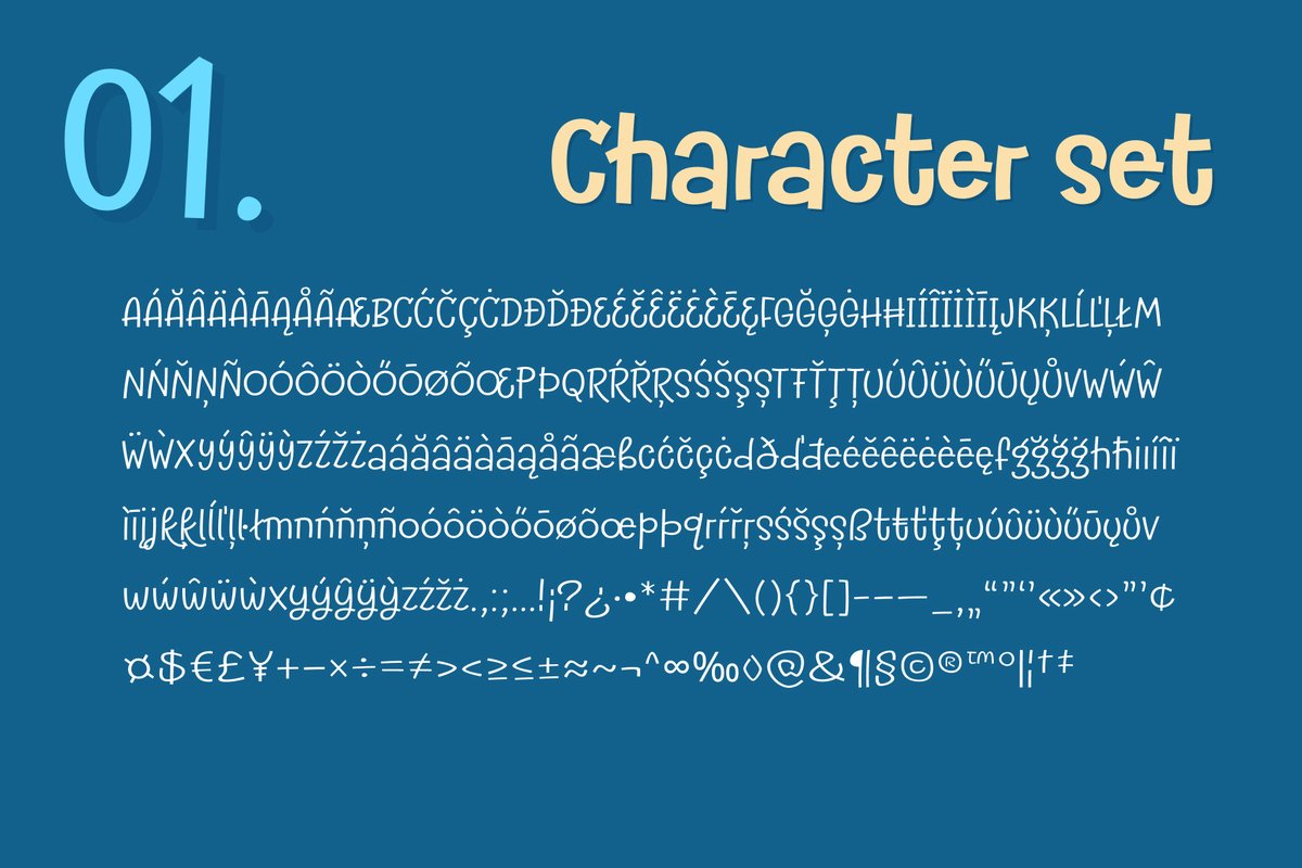
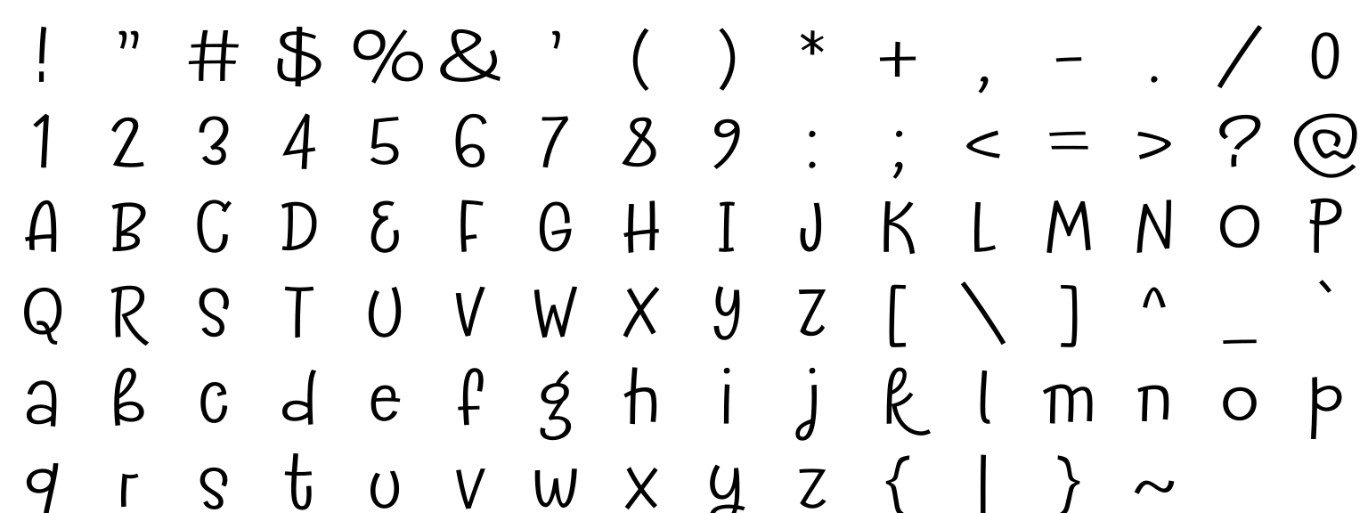
When a word repeats a letter, try the alternates: a second shape for the second letter makes a title look hand-lettered. A blue sheet in the specimens shows the full character set, so you can check the punctuation you need before you start.
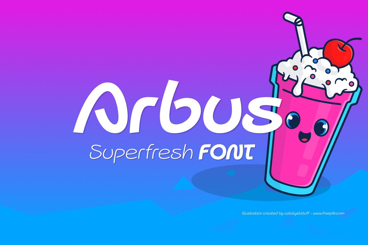
Cralic Coob is the narrow cut for taglines, and Arbus is a calmer partner for text.