The Arbus font is relaxed and cheerful but keeps its shapes simple. Use it for a picture-book page, baby-food packaging, a kids’ app screen or a classroom poster. Regular and Medium suit story text; heavy weights make a cover title.
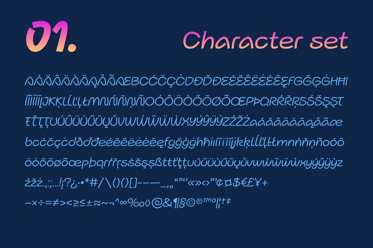
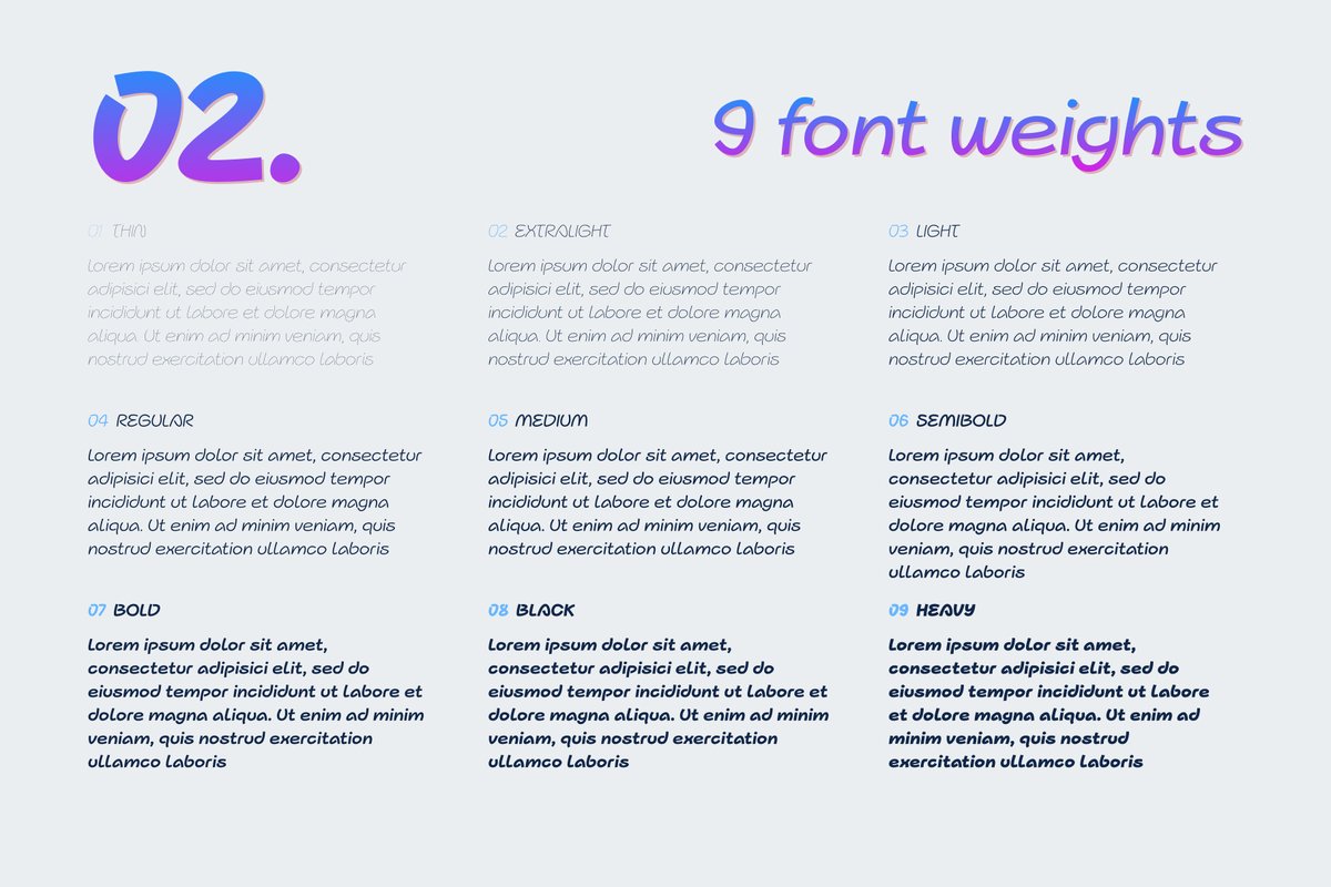
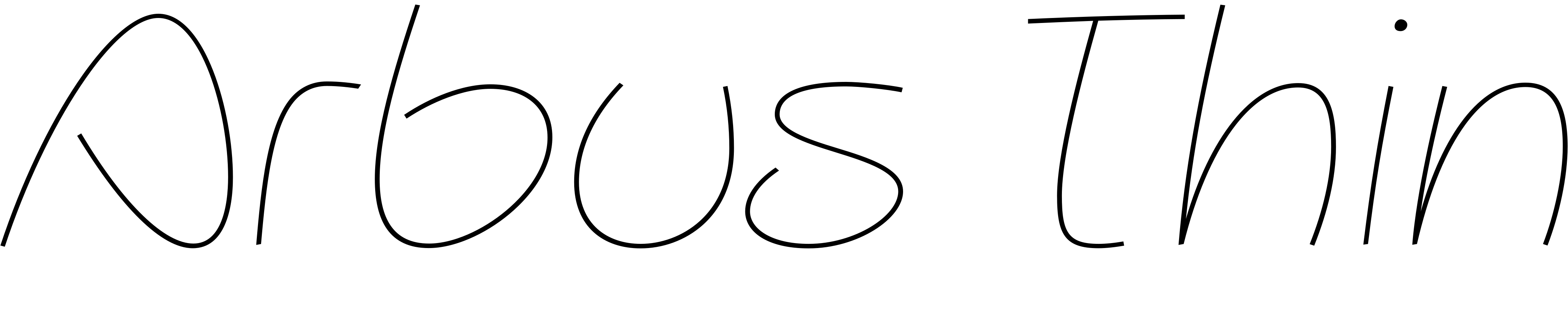
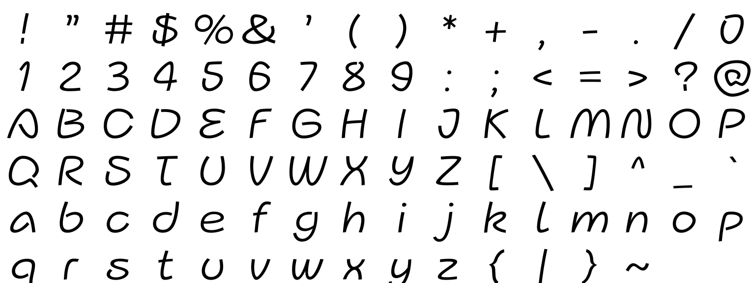
Words in a picture book sit next to the drawing and should not compete with it. That is the job Arbus is built for: plain, friendly letters with no decoration, in nine weights: Thin, ExtraLight, Light, Regular, Medium, SemiBold, Bold, Black and Heavy.
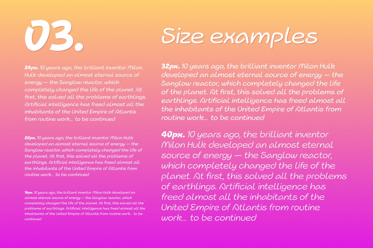
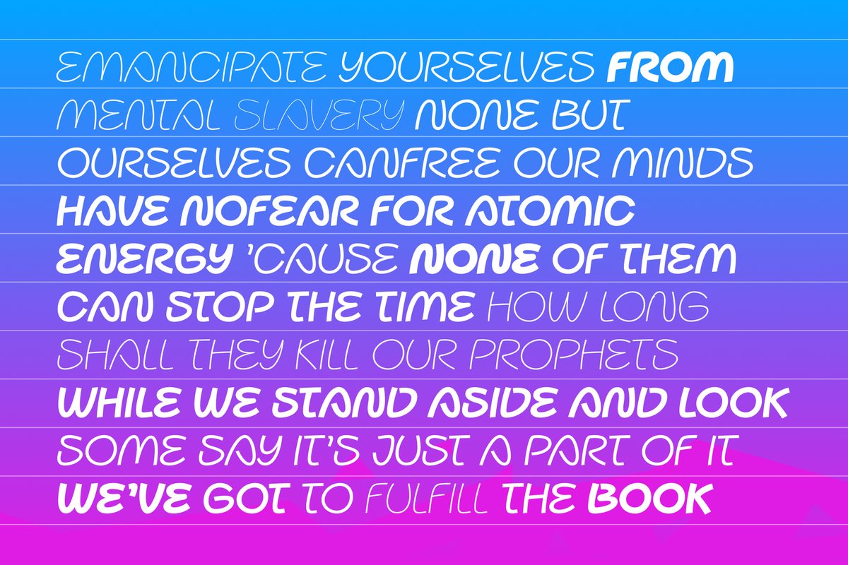
For a picture book, set story text in Regular or Medium, titles in Heavy and the line under a picture in Light. A size sheet in the specimens sets one paragraph at five sizes in white on a gradient, which helps you pick the smallest size for a worksheet or a baby-product label.
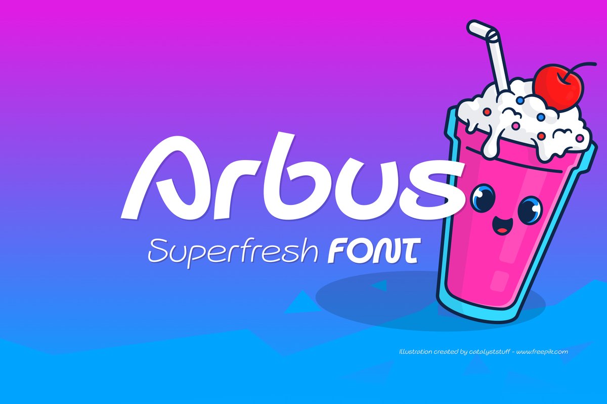
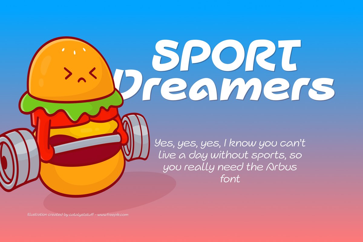
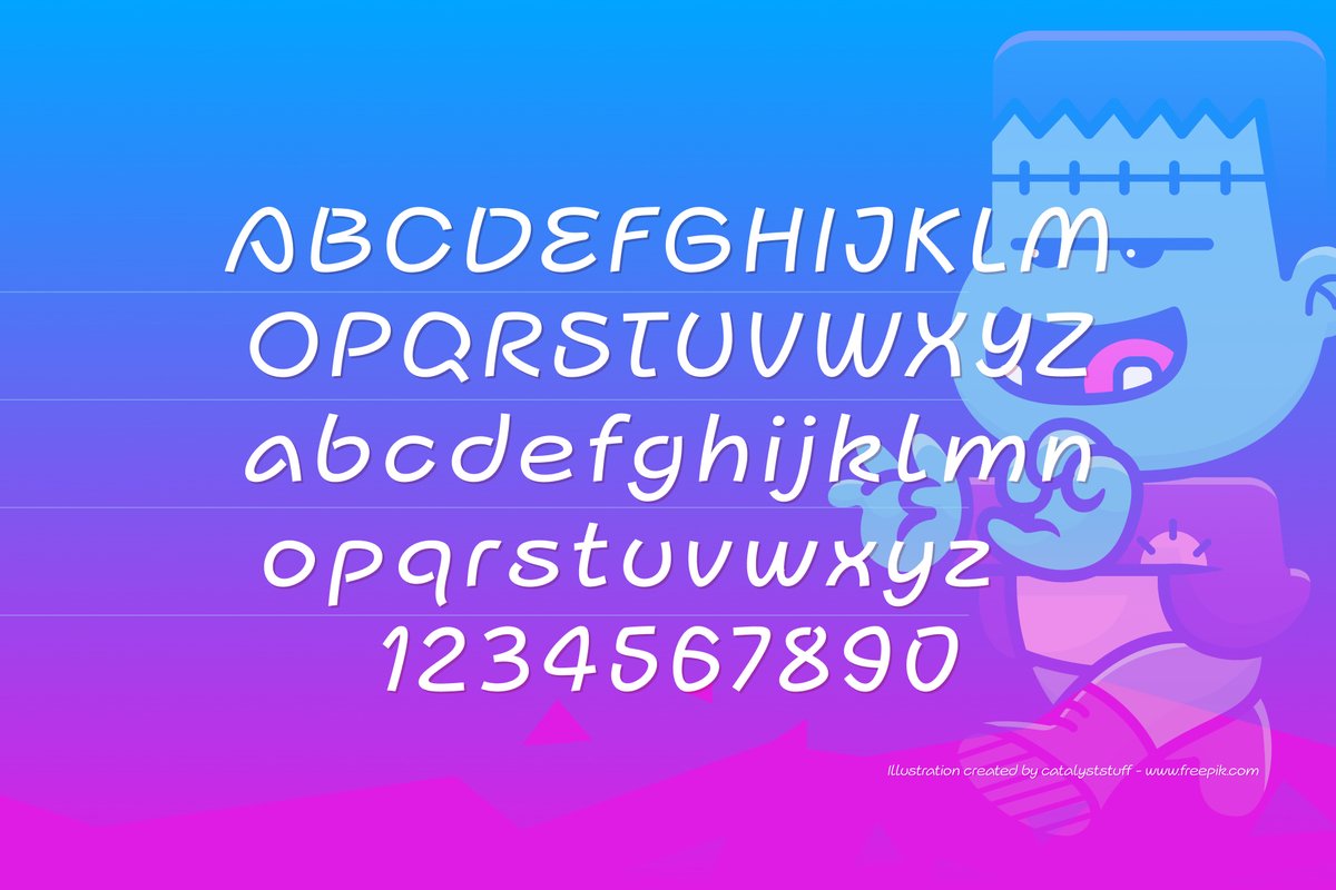
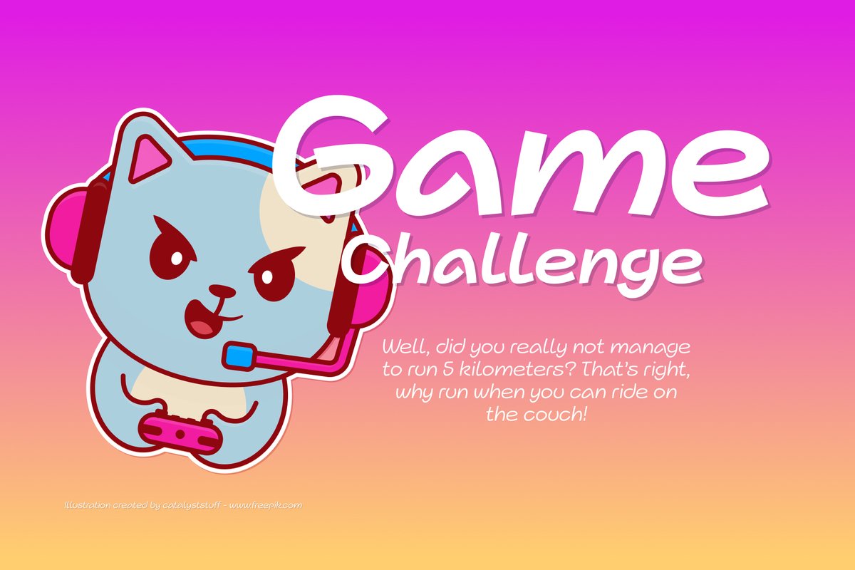
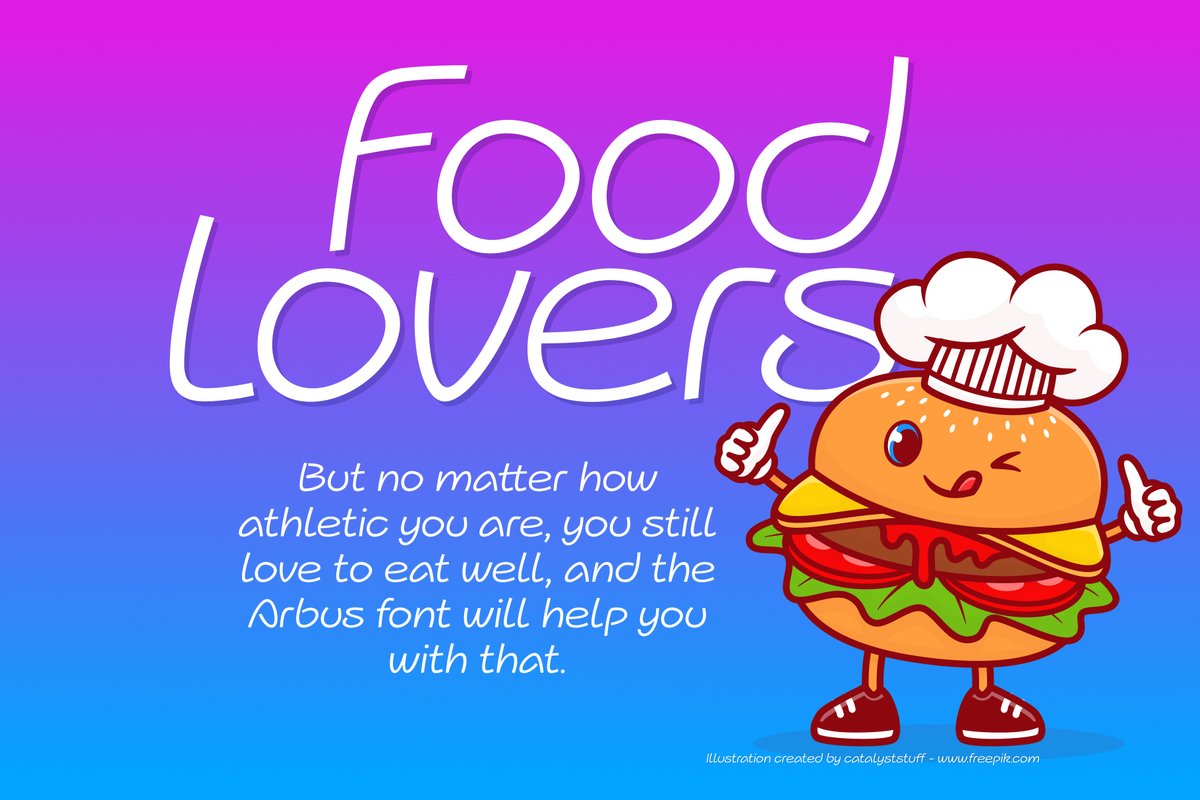
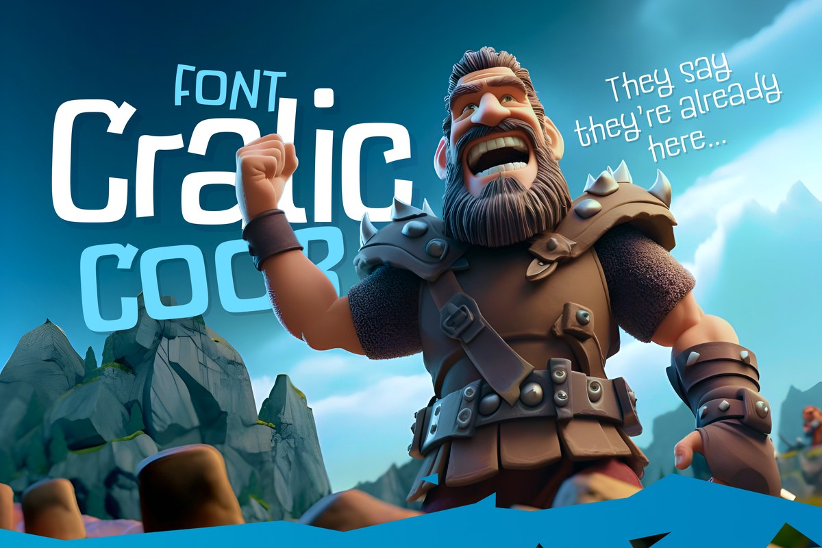
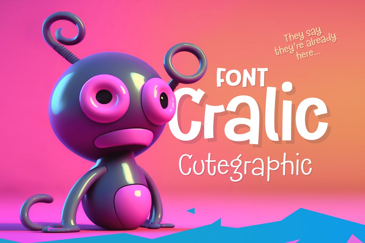
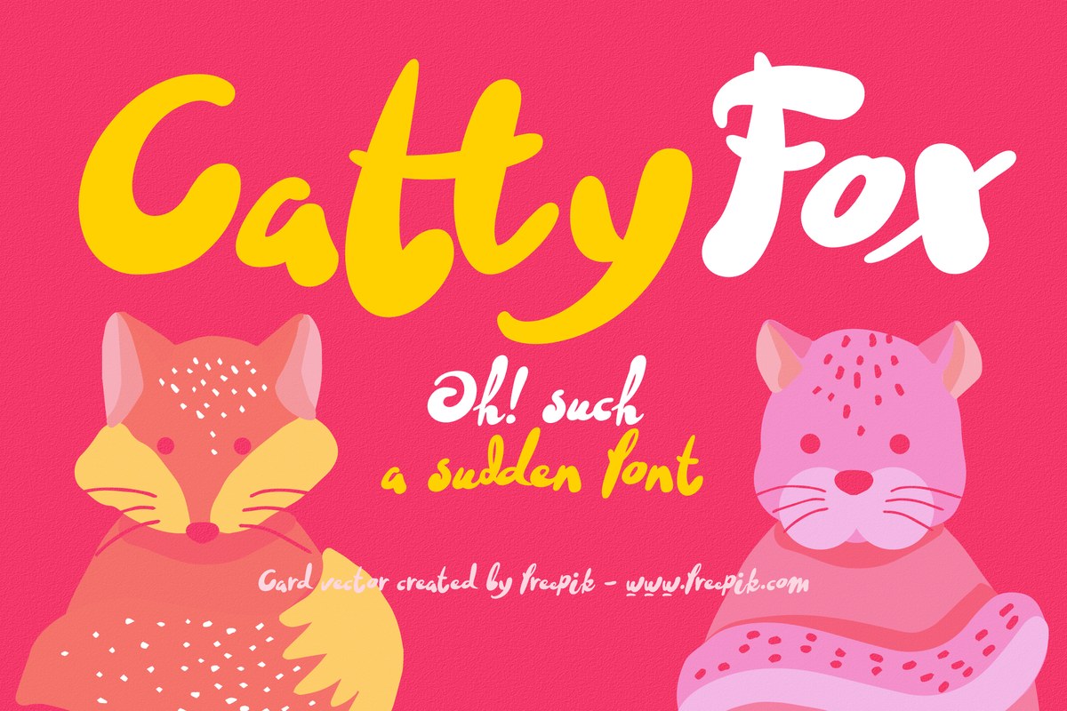
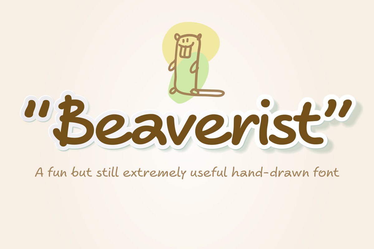
The specimens pair it with cartoon characters on flat, bright color, in game and food themes. They are not book pages, but they show how the letters sit next to drawings.
Cralic and Beebzz cover the same audience with louder, more decorated letters, so a kids’ project can use Arbus for text and one of them for titles.